Violin plot in R

Violin plots are an alternative to box plots that solves the issues regarding displaying the underlying distribution of the observations, as these plots show a kernel density estimate of the data. In this tutorial, we will show you how to create a violin plot in base R from a vector and from data frames, how to add mean points and split the R violin plots by group.
Vioplot from vector
In order to create a violin plot in R from a vector, you need to pass the vector to the vioplot function of the package of the same name. Consider, for instance, the following vector:
x <- c(6, 9, 0, 19, -1, 8, 12, 5, 3, 7,
       2, 4, 3, -8, -9, 8, 4, 12, 5, 14)
You can create a simple violin plot in R typing:
# install.packages("vioplot")
library("vioplot")

vioplot(x)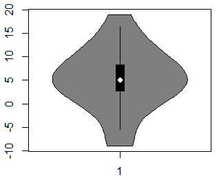
By default, the vioplot function will create a vertical violin plot in R, but if you set the argument horizontal to TRUE, you can create a horizontal violin plot.
vioplot(x, horizontal = TRUE)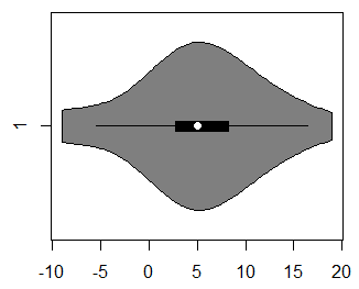
If you want to customize the violin plot, there are several arguments to control the graphical representation:
vioplot(x,
        col = 2,               # Color of the area
        rectCol = "red",       # Color of the rectangle
        lineCol = "white",     # Color of the line
        colMed = "green",      # Pch symbol color
        border = "black",      # Color of the border of the violin
        pchMed = 16,           # Pch symbol for the median
        plotCentre = "points") # If "line", plots a median line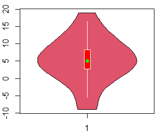
In addition, you can add jittered data points to a violin plot with the stripchart function as follows:
stripchart(x, method = "jitter", col = "blue",
           vertical = TRUE, pch = 19, add = TRUE)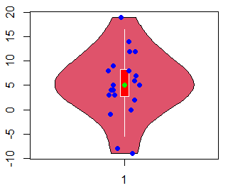
Note that if you have a horizontal violin plot, you will need to set vertical = FALSE in the previous function.
Moreover, you can draw a violin plot in R without taking into account the outliers of the data. For that purpose, you can assign to a variable the output of the boxplot function and then return the values of the original vector that are not outliers.
box <- boxplot(x)

x <- x[!(x %in% box$out)]

vioplot(x)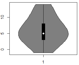
You can also set the argument ylog to TRUE if you want the Y-axis to be in logarithmic scale. Note that this only will work for positive data.
par(mfrow = c(1, 2))

vioplot(1:10)
vioplot(1:10, ylog = TRUE)

par(mfrow = c(1, 1))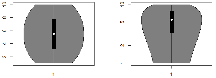
Histogram and violin plot
Finally, note that you can plot a violin plot over a histogram. Consider, for instance, that the underlying distribution of your data presents multimodality. In this case, a boxplot won’t represent this condition, but the violin plot will do. The following graphical representation will help you understand why a violin plot is useful:
set.seed(1)

# Multimodal data
n <- 10000
ii <- rbinom(n, 1, 0.5)
data <- rnorm(n, mean = 130, sd = 10) * ii +
        rnorm(n, mean = 80, sd = 5) * (1 - ii)

# Histogram
hist(data, probability = TRUE, col = "grey", axes = FALSE,
     main = "", xlab = "",  ylab = "")

# X-axis
axis(1)

# Density
lines(density(data), lwd = 2, col = "red")

# Add violin plot
par(new = TRUE)
vioplot(data, horizontal = TRUE, yaxt = "n", axes = FALSE,
        col = rgb(0, 1, 1, alpha = 0.15))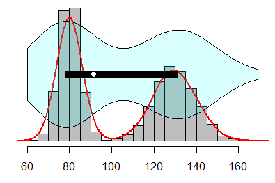
Violin plot by group
On the one hand, if you have a data frame with a variable containing groups, you can draw a violin plot from a formula, specifying the numerical variable against the factor. We will show you an example using the chickwts dataset of base R.
tail(chickwts) # Last rows weight feed
66 352 casein
67 359 casein
68 216 casein
69 222 casein
70 283 casein
71 332 caseinNow, you can specify the formula on the first argument, the colors and any desired graphical parameter:
data <- chickwts

vioplot(data$weight ~ data$feed, col = 2:length(levels(data$feed)),
        xlab = "Feed", ylab = "Weight")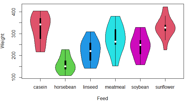
You can also add jittered data points to the previous violin plot with the stripchart function as follows:
stripchart(data$weight ~ data$feed, vertical = TRUE, method = "jitter",
           pch = 19, add = TRUE, col = 3:8)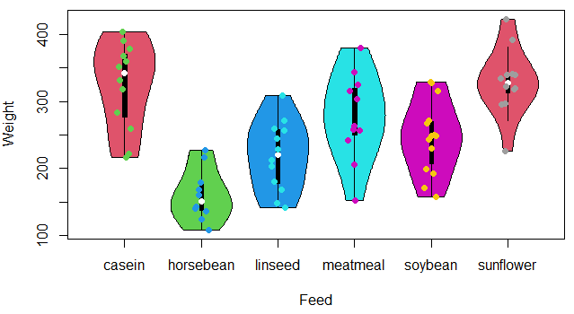
On the other hand, if your data set contains numeric columns that represents some variable, you can directly create the violin plot from the data frame. We will use, for instance, the trees dataset of base R.
tail(trees) # Last rows Girth Height Volume
26 17.3 81 55.4
27 17.5 82 55.7
28 17.9 80 58.3
29 18.0 80 51.5
30 18.0 80 51.0
31 20.6 87 77.0If you pass the dataframe to the vioplot function, you can create the plot. Note that if you stack this data frame with the stack function, you can specify a formula as in the previous example.
data <- trees

vioplot(data, col = 2:4, border = 2:4)

# Equivalent to:
stacked_data <- stack(trees)
vioplot(stacked_data$values ~ stacked_data$ind, col = 2:4,
        border = 2:4)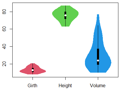
Reorder violin plot
The violin plots are ordered by default by the order of the levels of the categorical variable. Recall the violin plot we created before with the chickwts dataset and check that the order of the variables is the following:
levels(chickwts$feed) "casein" "horsebean" "linseed" "meatmeal" "soybean" "sunflower"However, you can override this behavior reordering the categorical variable by any characteristic of the data with the reorder function. In the following example we are going to use the median, but you could choose any function you want.
par(mfrow = c(1, 2))

data <- chickwts

#----------------
# Lower to higher
#----------------

medians <- reorder(data$feed, data$weight, median)
# medians <- with(data, reorder(feed, weight, median)) # Equivalent

vioplot(data$weight ~ medians, col = 2:(length(levels(data$feed)) + 1),
        xlab = "", ylab = "Weight", las = 2)

#----------------
# Higher to lower
#----------------

medians <- reorder(data$feed, -data$weight, median)
# medians <- with(data, reorder(feed, -weight, median)) # Equivalent

vioplot(data$weight ~ medians, col = 2:(length(levels(data$feed)) + 1),
        xlab = "", ylab = "Weight", las = 2)

par(mfrow = c(1, 1))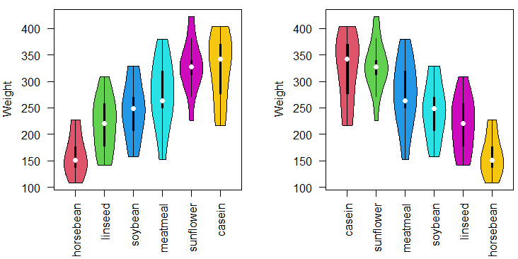
Add mean to base R violin plot
The vioplot function displays the median of the data, but if the distribution is not symmetric the mean and the median can be very distant. Hence, you can add the mean point, or any other characteristic of the data, to a violin plot in base R with the points function. Note that the steps are different if you are plotting a horizontal or vertical violin plot and single or multiple plots.
On the one hand, to display the mean point of a single violin plot you can type:
par(mfrow = c(1, 2))

# Exponential data
set.seed(5)
x <- rexp(20)

#-------------------
# Vertical vioplot
#-------------------

vioplot(x, col = 4)

# Add mean point
points(mean(x), pch = 19, col = "green", cex = 1.5)

#-------------------
# Horizontal vioplot
#-------------------

vioplot(x, col = 4, horizontal = TRUE)

# Add mean point
points(mean(x), 1, pch = 19, col = "green", cex = 1.5)

legend("topright", pch = c(21, 19), col = c("black", "green"),
       bg = "white", legend = c("Median", "Mean"), cex = 1.25)

par(mfrow = c(1, 1))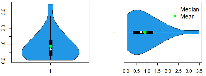
On the other hand, you can add mean points to a violin plot by group typing the following:
par(mfrow = c(1, 2))

set.seed(5)
df <- data.frame(x = rexp(20), y = rexp(20), z = rexp(20))

#--------------------------
# Vertical vioplot by group
#--------------------------

vioplot(df, col = 2:4)

# Add mean points
means <- apply(df, 2, mean)
means <- colMeans(df) # Equivalent (more efficient)

points(means, pch = 19, col = "green", cex = 1.25)

legend("top", pch = c(21, 19), col = c("black", "green"),
       bg = "white", legend = c("Median", "Mean"), cex = 1.25)

#----------------------------
# Horizontal vioplot by group
#----------------------------

vioplot(df, col = 2:4,
        horizontal = TRUE)

# Add mean points
means <- apply(df, 2, mean)
means <- colMeans(df) # Equivalent (more efficient)

points(means, 1:ncol(df), pch = 19, col = "green", cex = 1.25)

par(mfrow = c(1, 1))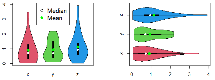
You can add points of other characteristic of the data changing the mean function for other.
Split R vioplots
It is worth to mention that you can split a violin plot in R. Consider, for instance, that you have divided the trees dataset into two groups, representing tall and small trees, depending on its height. Then, you can make use of the side and add arguments as follows:
data <- trees

tall <- trees[trees$Height >= 76, ]
small <- trees[trees$Height < 76, ]

vioplot(tall, side = "left", plotCentre = "line", col = 2)
vioplot(small, side = "right", plotCentre = "line", col = 3, add = TRUE)

legend("topleft", legend = c("Tall", "Small"), fill = c(2, 3), cex = 1.25)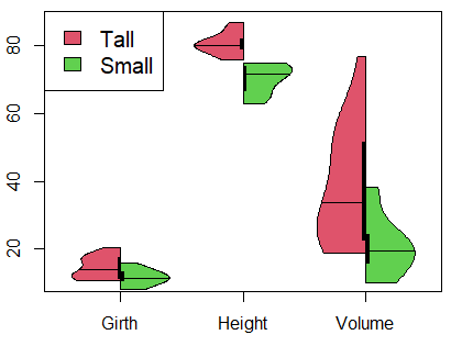
Even possible, it is recommended to plot median lines instead of points for split violin plots.