Economics charts in R using ggplot2
The econocharts package allows creating microeconomics or macroeconomics charts in R with functions with a very simple syntax. In this tutorial you will learn how to create supply and demand, indifference and Laffer curves in addition to production-possibility frontiers in R with this package.
Supply and demand curves in R
Related to supply and demand curves there are three functions named supply, demand and sdcurve. While the first two allows creating only supply or demand curves, respectively, the last allows displaying two or more curves on the same chart, in addition to the equilibrium points.
# Install the development version from GitHub:
# install.packages("devtools")
devtools::install_github("R-CoderDotCom/econocharts")

library(econocharts)
All the functions of the package allow input custom curves and they share almost all the same customization options. You can check the arguments that each function support typing something of the form of args(fun_name).
As a first example, the supply function will create a default supply curve if no argument is specified:
supply()
However, there are several arguments that can be customized. The most relevant are ncurves argument, which draws as many supply curves as specified, the type argument, which will set the type of supply curve created by default and x, which defines the Y-axis values where to calculate intersections from. In addition, there are several arguments that can be customized to modify the style of the resulting plot.
supply(ncurves = 1,            # Number of supply curves to be plotted
       type = "convex",        # Type of the curve ("line" or "convex")
       x = c(3, 5, 6),         # Y-axis values where to create intersections
       linecol = 4,            # Color of the curves
       generic = TRUE,         # Intersection labels are in a generic form (X_A, Y_A)
       geom = "label",         # Label type of the intersection points
       geomfill = "lightblue", # If geom = "label", is the background color of the label
       main = "Supply curve")  # Title of the plot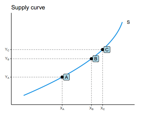
Note that you can also specify custom supply curve or curves to override the default curve, passing them as data frame as additional arguments.
The same will apply to the demand function, but we won’t show any example to avoid repeating the same twice.
Similarly, the supply and demand chart can be created with the sdcurve function as we pointed out before. By default, the function will create the following chart:
sdcurve()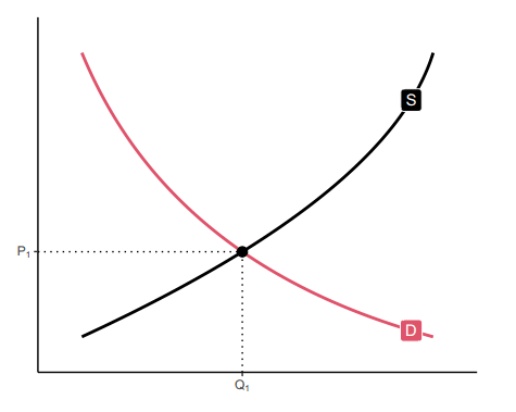
However, there are several arguments that you can customize. In you want to see the full arguments list check the documentation of the function typing ?sdcurve.
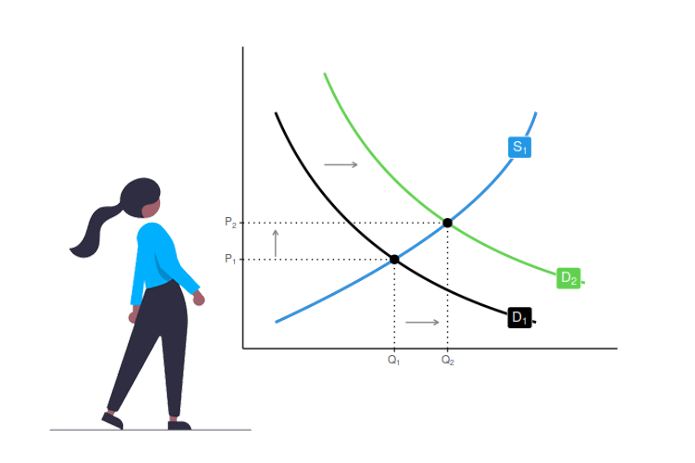
In the following example we are setting custom supply and demand curves and adding additional layers (arrows) to the plot.
# install.packages("ggplot2")
library(ggplot2)

# Add custom curves
supply1 <- data.frame(Hmisc::bezier(c(1, 3, 9),
                                    c(9, 3, 1)))

supply2 <- data.frame(Hmisc::bezier(c(2.5, 4.5, 10.5),
                                    c(10.5, 4.5, 2.5)))

demand1 <- data.frame(Hmisc::bezier(c(1, 8, 9),
                                    c(1, 5, 9)))

# Supply and demand curves and arrows
sdcurve(supply1, demand1, supply2, demand1,
        names = c("D[1]", "S[1]","D[2]", "S[1]")) +
  annotate("segment", x = 2.5, xend = 3.5, y = 7, yend = 7, # Add arrows
           arrow = arrow(length = unit(0.3, "lines")), colour = "grey50") +
  annotate("segment", x = 1, xend = 1, y = 3.5, yend = 4.5,
           arrow = arrow(length = unit(0.3, "lines")), colour = "grey50") +
  annotate("segment", x = 5, xend = 6, y = 1, yend = 1,
           arrow = arrow(length = unit(0.3, "lines")), colour = "grey50")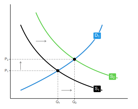
Indifference curves
The indifference function allows drawing indifference curves. The arguments of the function are very similar to the supply and demand functions. By default, the function will create the following chart:
indifference()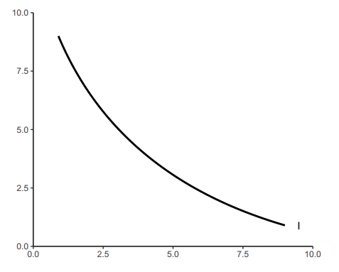
Nonetheless, you can customize the output with the function arguments. In the following block of code there is an example to create two customized indifference curves.
p <- indifference(ncurves = 2,  # Two curves
                  x = c(2, 4),  # Intersections
                  main = "Indifference curves", # Title
                  xlab = "Good X",              # X-axis label
                  ylab = "Good Y",              # Y-axis label
                  linecol = 2,  # Color of the curves
                  pointcol = 2) # Color of the intersection points

# Add a new point
int <- bind_rows(curve_intersect(data.frame(x = 1:1000, y = rep(3, nrow(p$curve))), p$curve + 1))

p$p + geom_point(data = int, size = 3, color = 2) +
      annotate(geom = "text", x = int$x + 0.25, y = int$y + 0.25, label = "C")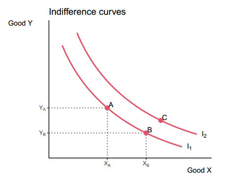
The function also allows specifying different types of indifference curves: “normal” (default), “pcom” (perfect complements) and “psubs” (perfect substitutes).
Perfect complements
If you set type = “pcom” you can create indifference curves for perfect complement goods. As an example, if you customize several arguments of the function as follows you can create the plot displayed below.
indifference(ncurves = 2,    # Two curves
             type = "pcom",  # Perfect complements
             main = "Indifference curves", # Title
             sub = "Perfect complements",  # Subtitle
             xlab = "Good X",
             ylab = "Good Y",
             bg.col = "#fff3cd", # Background color
             linecol = 1,  # Color of the curve
             pointcol = 2) # Color of the intersection points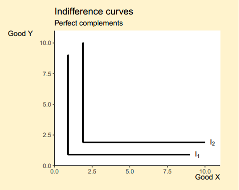
Perfect substitutes
If you want to create a chart of indifference curves for perfect substitutes, you can set type = “psubs” as follows:
indifference(ncurves = 3,                  # Three curves
             type = "psubs",               # Perfect substitutes
             main = "Indifference curves", # Title of the plot
             sub = "Perfect substitutes",  # Subtitle of the plot
             xlab = "Good X",              # X-axis label
             ylab = "Good Y",              # Y-axis label
             bg.col = "#fff3cd",           # Background color
             linecol = 1)                  # Color of the curves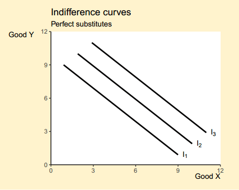
Production-possibility frontier
A production-possibility frontier can be plotted in R with the ppf function:
ppf()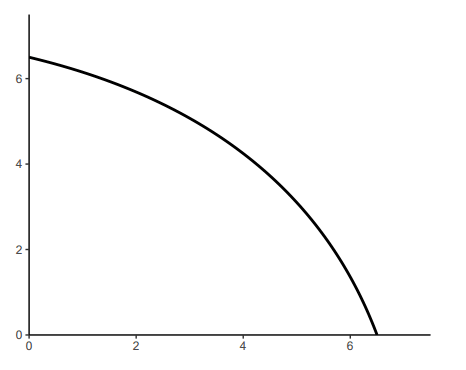
The function allows further customization with the available arguments. In the following example we are going to create a production-possibility frontier with several intersections, we are going to add a point out of the frontier, other inside and finally, we are going to add arrows to represent the marginal rate of substitution of the frontier.
p <- ppf(x = 4:6,                   # Intersections
         main = "PPF",              # Title
         geom = "text",             # Intersection labels as text
         generic = TRUE,            # Generic axis tick labels
         labels = c("A", "B", "C"), # Custom labels
         xlab = "Product B",        # X-axis label
         ylab = "Product A",        # Y-axis label
         acol = 3)                  # Color of the area

# Add more layers to the plot
p$p + geom_point(data = data.frame(x = 5, y = 5), size = 3) +
  geom_point(data = data.frame(x = 2, y = 2), size = 3) +
  annotate(geom = "text", x = 2.25, y = 2.25, label = "D") +
  annotate(geom = "text", x = 5.25, y = 5.25, label = "E") +
  annotate("segment", x = 3.1, xend = 4.25, y = 5, yend = 5,
           arrow = arrow(length = unit(0.5, "lines")), colour = 3, lwd = 1) +
  annotate("segment", x = 4.25, xend = 4.25, y = 5, yend = 4,
           arrow = arrow(length = unit(0.5, "lines")), colour = 3, lwd = 1)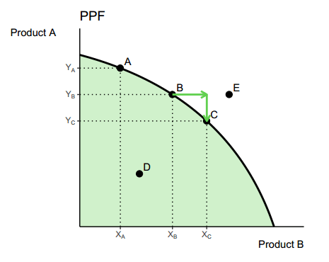
Laffer curve
Finally, the laffer function allows plotting a Laffer curve, which by default is as follows:
laffer()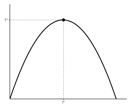
This function allows specifying several arguments, as the color and transparency of the area behind the curve or the color of the optimum point, among others.
laffer(xlab = "t",         # X-axis label
       ylab = "T",         # Y-axis label
       acol = "lightblue", # Color of the area
       alpha = 0.3,        # Transparency of the area
       pointcol = 4)       # Color of the optimum point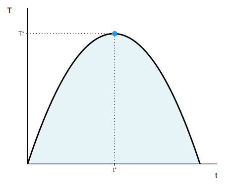
![]()