Boxplot in R

What is box plot in R programming? A boxplot in R, also known as box and whisker plot, is a graphical representation which allows you to summarize the main characteristics of the data (position, dispersion, skewness, …) and identify the presence of outliers. In this tutorial we will review how to make a base R box plot.
How to interpret a box plot in R?
The box of a boxplot starts in the first quartile (25%) and ends in the third (75%). Hence, the box represents the 50% of the central data, with a line inside that represents the median. On each side of the box there is drawn a segment to the furthest data without counting boxplot outliers, that in case there exist, will be represented with circles.
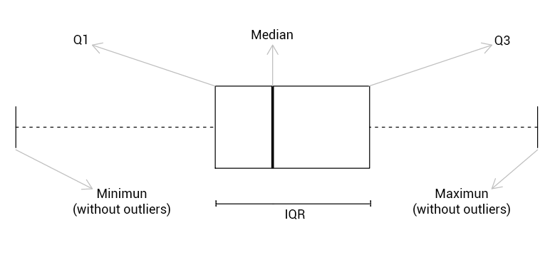
An outlier is that observation that is very distant from the rest of the data. A data point is said to be an outlier if it is greater than \(Q_3\) + 1.5 \(\cdot IQR\) (right outlier), or is less than $ Q_1$ – 1.5 \(\cdot IQR\) (left outlier), being \(Q_1\) the first quartile, \(Q_3\) the third quartile and \(IQR\) the interquartile range (\(Q_3\) – \(Q_1\)) that represents the width of the box for horizontal boxplots.
The boxplot function in R
A box and whisker plot in base R can be plotted with the boxplot function. You can plot this type of graph from different inputs, like vectors or data frames, as we will review in the following subsections. In case of plotting boxplots for multiple groups in the same graph, you can also specify a formula as input. In addition, you can customize the resulting box plot with several arguments.
Boxplot from vector
If you are wondering how to make box plot in R from vector, you just need to pass the vector to the boxplot function. By default, the boxplot will be vertical, but you can change the orientation setting the horizontal argument to TRUE.
x <- c(8, 5, 14, -9, 19, 12, 3, 9, 7, 4,
       4, 6, 8, 12, -8, 2, 0, -1, 5, 3)
boxplot(x, horizontal = TRUE)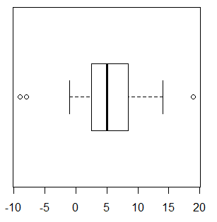
Note that boxplots hide the underlying distribution of the data. In order to solve this issue, you can add points to boxplot in R with the stripchart function (jittered data points will avoid to overplot the outliers) as follows:
stripchart(x, method = "jitter", pch = 19, add = TRUE, col = "blue")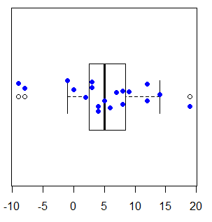
Since R 4.0.0 boxplots are gray by default instead of white.
Box plot with confidence interval for the median
You can represent the 95% confidence intervals for the median in an R boxplot, setting the notch argument to TRUE.
boxplot(x, notch = TRUE)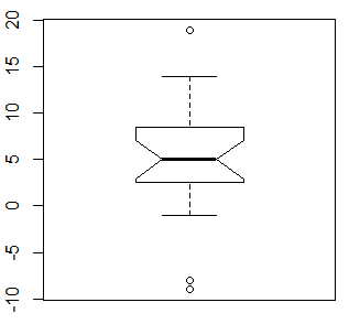
Note that if the notches of two or more boxplots don’t overlap means there is strong evidence that the medians differ.
Boxplot by group in R
If your dataset has a categorical variable containing groups, you can create a boxplot from formula. In this example, we are going to use the base R chickwts dataset.
head(chickwts) weight feed
1 179 horsebean
2 160 horsebean
3 136 horsebean
4 227 horsebean
5 217 horsebean
6 168 horsebeanNow, you can create a boxplot of the weight against the type of feed. Notice that when working with datasets you can call the variable names if you specify the dataframe name in the data argument.
boxplot(chickwts$weight ~ chickwts$feed)
boxplot(weight ~ feed, data = chickwts) # Equivalent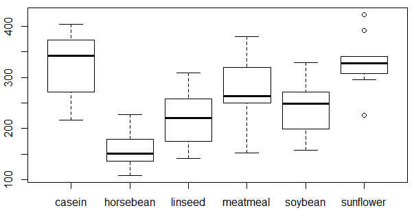
In addition, in this example you could add points to each boxplot typing:
stripchart(chickwts$weight ~ chickwts$feed, vertical = TRUE, method = "jitter",
           pch = 19, add = TRUE, col = 1:length(levels(chickwts$feed)))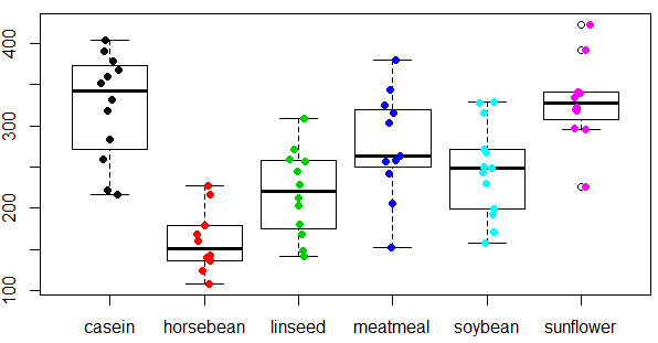
Multiple boxplots
In case all variables of your dataset are numeric variables, you can directly create a boxplot from a dataframe. For illustration purposes we are going to use the trees dataset.
head(trees) Girth Height Volume
1 8.3 70 10.3
2 8.6 65 10.3
3 8.8 63 10.2
4 10.5 72 16.4
5 10.7 81 18.8
6 10.8 83 19.7Note the difference respect to the chickwts dataset. Nevertheless, you can convert this dataset as one of the same format as the chickwts dataset with the stack function.
stacked_df <- stack(trees)
head(stacked_df)
values ind
1 8.3 Girth
2 8.6 Girth
3 8.8 Girth
4 10.5 Girth
5 10.7 Girth
6 10.8 GirthNow, you can plot the boxplot with the original or the stacked dataframe as we did in the previous section. Note that you can change the boxplot color by group with a vector of colors as parameters of the col argument. Thus, each boxplot will have a different color.
# Boxplot from the R trees dataset
boxplot(trees, col = rainbow(ncol(trees)))

# Equivalent to:
boxplot(stacked_df$values ~ stacked_df$ind,
        col = rainbow(ncol(trees)))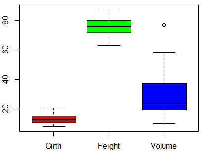
You can stack dataframe columns with the stack function.
In case you need to plot a different boxplot for each column of your R dataframe you can use the lapply function and iterate over each column. In this case, we will divide the graphics par in one row and as many columns as the dataset has, but you could plot individual graphs. Note that the invisible function avoids displaying the output text of the lapply function.
par(mfrow = c(1, ncol(trees)))
invisible(lapply(1:ncol(trees), function(i) boxplot(trees[, i])))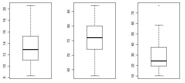
Reorder boxplot in R
By default, boxplots will be plotted with the order of the factors in the data. However, you can reorder or sort a boxplot in R reordering the data by any metric, like the median or the mean, with the reorder function.
par(mfrow = c(1, 2))

# Lower to higher
medians <- reorder(chickwts$feed, chickwts$weight, median)
# medians <- with(chickwts, reorder(feed, weight, median)) # Equivalent

boxplot(chickwts$weight ~ medians, las = 2, xlab = "", ylab = "")

# Higher to lower
medians <- reorder(chickwts$feed, -chickwts$weight, median)
# medians <- with(chickwts, reorder(feed, -weight, median)) # Equivalent

boxplot(chickwts$weight ~ medians, las = 2, xlab = "", ylab = "")

par(mfrow = c(1, 1))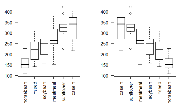
If you want to order the boxplot with other metric, just change median for the one you prefer.
Boxplot customization
A boxplot can be fully customized for a nice result. In the following block of code we show a wide example of how to customize an R box plot and how to add a grid. Note that there are even more arguments than the ones in the following example to customize the boxplot, like boxlty, boxlwd, medlty or staplelwd. Review the full list of graphical boxplot parameters in the pars argument of help(bxp) or ?bxp.
plot.new()

set.seed(1)

# Light gray background
rect(par("usr")[1], par("usr")[3], par("usr")[2], par("usr")[4],
     col = "#ebebeb")

# Add white grid
grid(nx = NULL, ny = NULL, col = "white", lty = 1,
     lwd = par("lwd"), equilogs = TRUE)

# Boxplot
par(new = TRUE)
boxplot(rnorm(500), # Data
        horizontal = FALSE, # Horizontal or vertical plot
        lwd = 2, # Lines width
        col = rgb(1, 0, 0, alpha = 0.4), # Color
        xlab = "X label",  # X-axis label
        ylab = "Y label",  # Y-axis label
        main = "Customized boxplot in base R", # Title
        notch = TRUE, # Add notch if TRUE
        border = "black",  # Boxplot border color
        outpch = 25,       # Outliers symbol
        outbg = "green",   # Outliers color
        whiskcol = "blue", # Whisker color
        whisklty = 2,      # Whisker line type
        lty = 1) # Line type (box and median)

# Add a legend
legend("topright", legend = "Boxplot", # Position and title
    fill = rgb(1, 0, 0, alpha = 0.4),  # Color
    inset = c(0.03, 0.05), # Modify margins
    bg = "white") # Legend background color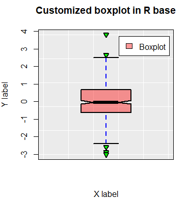
Add mean point to a boxplot in R
By default, when you create a boxplot the median is displayed. Nevertheless, you may also like to display the mean or other characteristic of the data. For that purpose, you can use the segments function if you want to display a line as the median, or the points function to just add points. Note that the code is slightly different if you create a vertical boxplot or a horizontal boxplot.
In the following code block we show you how to add mean points and segments to both type of boxplots when working with a single boxplot.
par(mfrow = c(1, 2))

#-----------------
# Vertical boxplot
#-----------------

boxplot(x)

# Add mean line
segments(x0 = 0.8, y0 = mean(x),
         x1 = 1.2, y1 = mean(x),
         col = "red", lwd = 2)
# abline(h = mean(x), col = 2, lwd = 2) # Entire line

# Add mean point
points(mean(x), col = 3, pch = 19)


#-------------------
# Horizontal boxplot
#-------------------

boxplot(x, horizontal = TRUE)

# Add mean line
segments(x0 = mean(x), y0 = 0.8,
         x1 = mean(x), y1 = 1.2,
         col = "red", lwd = 2)
# abline(v = mean(x), col = 2, lwd = 2) # Entire line

# Add mean point
points(mean(x), 1, col = 3, pch = 19)

par(mfrow = c(1, 1))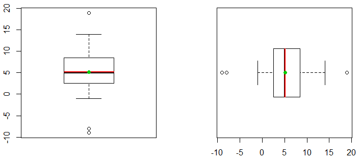
Note that, in this case, the mean and the median are almost equal, as the distribution is symmetric.
You can change the mean function of the previous code for other function to display other measures.
You can also add the mean point to boxplot by group. In this case, you can make use of the lapply function to avoid for loops. In order to calculate the mean for each group you can use the apply function by columns or the colMeans function. You can follow the code block to add the lines and points for horizontal and vertical box and whiskers diagrams.
par(mfrow = c(1, 2))

my_df <- trees

#--------------------------
# Vertical boxplot by group
#--------------------------

boxplot(my_df, col = rgb(0, 1, 1, alpha = 0.25))

# Add mean lines
invisible(lapply(1:ncol(my_df),
                function(i) segments(x0 = i - 0.4,
                                     y0 = mean(my_df[, i]),
                                     x1 = i + 0.4,
                                     y1 = mean(my_df[, i]),
                                     col = "red", lwd = 2)))

# Add mean points
means <- apply(my_df, 2, mean)
means <- colMeans(my_df) # Equivalent (more efficient)

points(means, col = "red", pch = 19)


#----------------------------
# Horizontal boxplot by group
#----------------------------

boxplot(my_df, col = rgb(0, 1, 1, alpha = 0.25),
        horizontal = TRUE)

# Add mean lines
invisible(lapply(1:ncol(my_df),
                function(i) segments(x0 = mean(my_df[, i]),
                                     y0 = i - 0.4,
                                     x1 = mean(my_df[, i]),
                                     y1 = i + 0.4,
                                     col = "red", lwd = 2)))

# Add mean points
means <- apply(my_df, 2, mean)
means <- colMeans(my_df) # Equivalent (more efficient)

points(means, 1:ncol(my_df), col = "red", pch = 19)

par(mfrow = c(1, 1))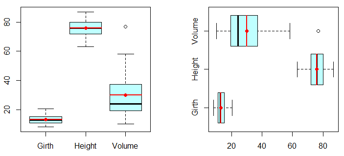
Return values from boxplot
If you assign the boxplot to a variable, you can return a list with different components. Create a boxplot with the trees dataset and store it in a variable:
res <- boxplot(trees)
res
$`stats`
[, 1] [, 2] [, 3]
[1, ] 8.30 63 10.2
[2, ] 11.05 72 19.4
[3, ] 12.90 76 24.2
[4, ] 15.25 80 37.3
[5, ] 20.60 87 58.3
$n
[1] 31 31 31
$conf
[, 1] [, 2] [, 3]
[1, ] 11.70814 73.72979 19.1204
[2, ] 14.09186 78.27021 29.2796
$out
[1] 77
$group
[1] 3
$names
[1] "Girth" "Height" "Volume"The output will contain six elements described below:
- stats: each column represents the lower whisker, the first quartile, the median, the third quartile and the upper whisker of each group.
- n: number of observations of each group.
- conf: each column represents the lower and upper extremes of the confidence interval of the median.
- out: total number of outliers.
- group: total number of groups.
- names: names of each group.
It is worth to mention that you can create a boxplot from the variable you have just created (res) with the bxp function.
bxp(res)Boxplot and histogram
One limitation of box plots is that there are not designed to detect multimodality. For that reason, it is also recommended plotting a boxplot combined with a histogram or a density line.
par(mfrow = c(1, 1))

# Multimodal data
n <- 20000
ii <- rbinom(n, 1, 0.5)
dat <- rnorm(n, mean = 110, sd = 11) * ii +
       rnorm(n, mean = 70, sd = 5) * (1 - ii)

# Histogram
hist(dat, probability = TRUE, ylab = "", col = "grey",
     axes = FALSE, main = "")

# Axis
axis(1)

# Density
lines(density(dat), col = "red", lwd = 2)

# Add boxplot
par(new = TRUE)
boxplot(dat, horizontal = TRUE, axes = FALSE,
        lwd = 2, col = rgb(0, 1, 1, alpha = 0.15))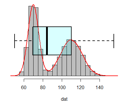
The boxplot can’t detect multimodality in the data.
As an alternative to this problem you can use violin plots or beanplots.
Boxplot in R ggplot2
The boxplots we created in the previous sections can also be plotted with ggplot2 library. For further details read the complete ggplot2 boxplots tutorial.
Boxplot in ggplot2 from vector
The input of the ggplot library has to be a data frame, so you will need convert the vector to data.frame class. Then, you can use the geom_boxplot function to create and customize the box and the stat_boxplot function to add the error bars.
# install.packages("ggplot2")
library(ggplot2)

# Data
x <- c(8, 5, 14, -9, 19, 12, 3, 9, 7, 4,
       4, 6, 8, 12, -8, 2, 0, -1, 5, 3)

# Transform our 'x' vector
x <- data.frame(x)

# Boxplot with vector
ggplot(data = x, aes(x = "", y = x)) +
       stat_boxplot(geom = "errorbar",      # Error bars
                    width = 0.2) +
       geom_boxplot(fill = "#4271AE",       # Box color
                    outlier.colour = "red", # Outliers color
                    alpha = 0.9) +          # Box color transparency
       ggtitle("Boxplot with vector") + # Plot title
       xlab("") +   # X-axis label
       coord_flip() # Horizontal boxplot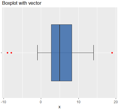
Boxplot in ggplot2 by group
If you want to create a ggplot boxplot by group, you will need to specify variables in the aes argument as follows:
# Boxplot by group
ggplot(data = chickwts, aes(x = feed, y = weight)) +
       stat_boxplot(geom = "errorbar", # Boxplot with error bars
                    width = 0.2) +
       geom_boxplot(fill = "#4271AE", colour = "#1F3552", # Colors
                    alpha = 0.9, outlier.colour = "red") +
       scale_y_continuous(name = "Weight") +  # Continuous variable label
       scale_x_discrete(name = "Feed") +      # Group label
       ggtitle("Boxplot by groups ggplot2") + # Plot title
       theme(axis.line = element_line(colour = "black", # Theme customization
                                      size = 0.25))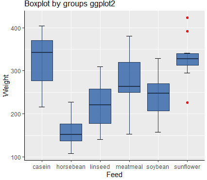
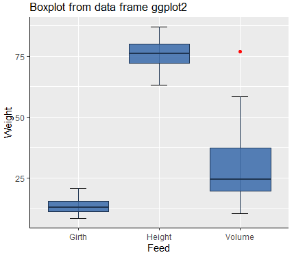
Boxplot in ggplot2 from wide format dataframe
Finally, for creating a boxplot with ggplot2 with a data frame like the trees dataset, you will need to stack the data with the stack function:
# Boxplot from dataframe
ggplot(data = stack(trees), aes(x = ind, y = values)) +
       stat_boxplot(geom = "errorbar", # Boxplot with error bars
                    width = 0.2) +
       geom_boxplot(fill = "#4271AE", colour = "#1F3552", # Colors
                    alpha = 0.9, outlier.colour = "red") +
       scale_y_continuous(name = "Weight") +  # Continuous variable label
       scale_x_discrete(name = "Feed") +      # Group label
       ggtitle("Boxplot from data frame ggplot2") + # Plot title
       theme(axis.line = element_line(colour = "black", # Theme customization
                                      size = 0.25))