Density plot in R

The probability density function of a vector x, denoted by f(x) describes the probability of the variable taking certain value. The empirical probability density function is a smoothed version of the histogram. This is also known as the Parzen–Rosenblatt estimator or kernel estimator. You can make a density plot in R in very simple steps we will show you in this tutorial, so at the end of the reading you will know how to plot a density in R or in RStudio.
Plot density function in R
To create a density plot in R you can plot the object created with the R density function, that will plot a density curve in a new R window. You can also overlay the density curve over an R histogram with the lines function.
set.seed(1234)

# Generate data
x <- rnorm(500)
par(mfrow = c(1, 2))
# Create a histogram
hist(x, freq = FALSE, main = "Histogram and density")
# Calculate density
dx <- density(x)
# Add density
lines(dx, lwd = 2, col = "red")
# Plot the density without histogram
plot(dx, lwd = 2, col = "red",
main = "Density")
# Add the data-poins with noise in the X-axis
rug(jitter(x))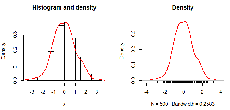
The result is the empirical density function. An alternative to create the empirical probability density function in R is the epdfPlot function of the EnvStats package. With this function, you can pass the numerical vector directly as a parameter.
# Equivalent alternative with EnvStats package
# install.packages("EnvStats")

library(EnvStats)

epdfPlot(x, epdf.col = "red")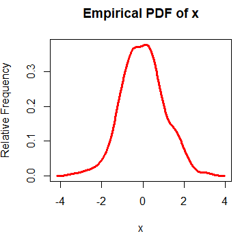
Kernel density bandwidth selection
When you plot a probability density function in R you plot a kernel density estimate. The kernel density plot is a non-parametric approach that needs a bandwidth to be chosen. You can set the bandwidth with the bw argument of the density function.
In general, a big bandwidth will oversmooth the density curve, and a small one will undersmooth (overfit) the kernel density estimation in R. In the following code block you will find an example describing this issue.
par(mfrow = c(1, 2))

# Big bandwidth
plot(density(x, bw = 20), lwd = 2,
     col = "red", main = "Too big bandwidth")

# Small bandwidth
plot(density(x, bw = 0.05), lwd = 2,
     col = "red", main = "Too small bandwidth")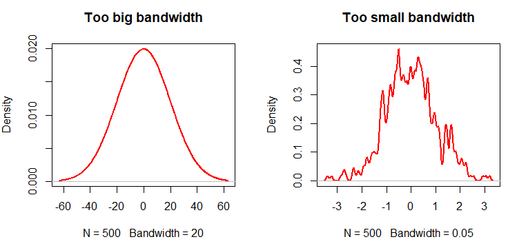
Equivalently, you can pass arguments of the density function to epdfPlot within a list as parameter of the density.arg.list argument. In this case, we are passing the bw argument of the density function.
# Equivalent alternative with EnvStats package
epdfPlot(x, epdf.col = "red", density.arg.list = list(bw = 0.05),
         main = "Too small bandwidth")
The literature of kernel density bandwidth selection is wide. However, there are three main commonly used approaches to select the parameter:
-
By default, the
densityfunction uses the rule of thumb approach - Using the plug-in methodology created by Sheather and Jones (1991).
- Using the cross-validation approach.
The following code shows how to implement each method:
par(mfrow = c(1, 3))

# Rule of thumb
plot(density(x), main = "Rule of thumb",
     cex.lab = 1.5, cex.main = 1.75, lwd = 2)

# Unbiased cross validation
plot(density(x, bw = bw.ucv(x)), col = 2, # Same as: bw = "UCV"
     main = "Cross-validation", cex.lab = 1.5,
     cex.main = 1.75, lwd = 2)

# Plug-in
plot(density(x, bw = bw.SJ(x)), col = 4, # Same as: bw = "SJ"
     main = "Plug-in bandwidth selection",
     cex.lab = 1.5, cex.main = 1.75, lwd = 2)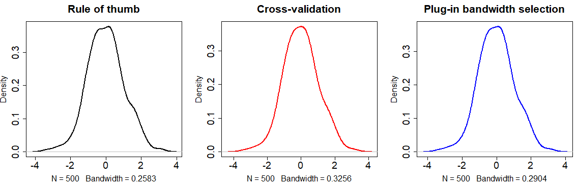
The selection of the bandwidth parameter will depend on the data you are working with or the objectives of your study. Choose the bandwidth approach carefully.
You can also change the kernel with the kernel argument, that will default to Gaussian. Although we won’t go into more details, the available kernels are "gaussian", "epanechnikov", "rectangular", "triangular“, "biweight", "cosine" and "optcosine". The selection will depend on the data you are working with.
Multiple density curves in one plot
With the lines function you can plot multiple density curves in R. You just need to plot a density in R and add all the new curves you want.
par(mfrow = c(1, 1))

plot(dx, lwd = 2, col = "red",
    main = "Multiple curves", xlab = "")

set.seed(2)
y <- rnorm(500) + 1
dy <- density(y)

lines(dy, col = "blue", lwd = 2)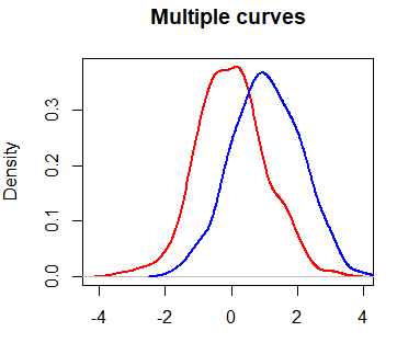
However, you may have noticed that the blue curve is cropped on the right side. To fix this, you can set xlim and ylim arguments as a vector containing the corresponding minimum and maximum axis values of the densities you would like to plot.
plot(dx, lwd = 2, col = "red",
    main = "Multiple curves with correct axis limits", xlab = "",
    xlim = c(min(dx$x, dy$x), c(max(dx$x, dy$x))),  # Min and Max X-axis limits
    ylim = c(min(dx$y, dy$y), c(max(dx$y, dy$y))))  # Min and Max Y-axis limits

lines(dy, col = "blue", lwd = 2)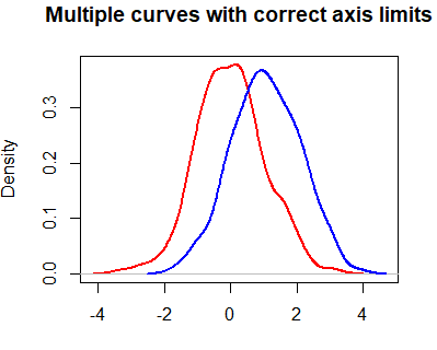
When plotting multiple lines, it is a good practice to set the axis limits with the xlim and ylim arguments of the plot function, because the plot limits will default to the limits of the main curve.
Density comparison chart in R
There are several ways to compare densities. One approach is to use the densityPlot function of the car package. This function creates non-parametric density estimates conditioned by a factor, if specified. Type ?densityPlot for additional information.
# Sample groups
set.seed(1)
groups <- factor(sample(c(1, 2), 100, replace = TRUE))

variable <- numeric(100)

# Group 1: mean 3
variable[groups == 1] <- rnorm(length(variable[groups == 1]), 3)

# Group 2: mean 0
variable[groups == 2] <- rnorm(length(variable[groups == 2]))
# Comparing densities by group
# install.packages("car")
library(car)
densityPlot(variable, groups)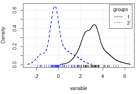
Other alternative is to use the sm.density.compare function of the sm library, that compares the densities in a permutation test of equality.
# install.packages("sm")
library(sm)

sm.density.compare(variable, groups)
legend("topleft", levels(groups), col = 2:4, lty = 1:2) 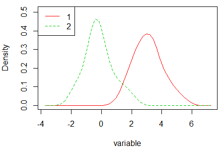
Note that the density graphs are different due to the methods to compute the densities are different. Check the bibliography of each method, available in the documentation of each function, for additional details.
Fill area under density curves
In base R you can use the polygon function to fill the area under the density curve. If you use the rgb function in the col argument instead using a normal color, you can set the transparency of the area of the density plot with the alpha argument, that goes from 0 to all transparency to 1, for a total opaque color.
par(mfrow = c(1, 2))

#-----------------------
# Shade area under curve
#-----------------------

plot(dx, lwd = 2, main = "", xlab = "",
    col = "red", xlim = c(-4, 6), ylim = c(0, 0.5))
polygon(dx, col = "red")
polygon(dx$x, dx$y, col = "red") # Equivalent

set.seed(2)
y <- rnorm(500) + 2
dy <- density(y)

lines(dy, lwd = 2, col = "blue")
polygon(dy, col = "blue")


#-----------------------------------------
# Shade area under curve with transparency
#-----------------------------------------

plot(dx, lwd = 2, main = "", xlab = "",
     col = "red", xlim = c(-4, 6), ylim = c(0, 0.5))
polygon(dx, col = rgb(1, 0, 0, alpha = 0.5))

lines(dy, lwd = 2, col = "blue")
polygon(dy, col = rgb(0, 0, 1, alpha = 0.5))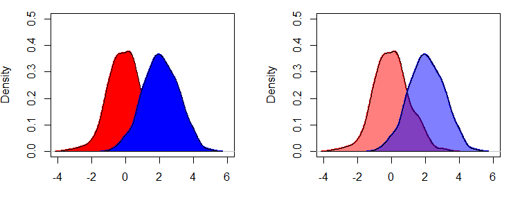
If you are using the EnvStats package, you can add the color setting with the curve.fill.col argument of the epdfPlot function.
# Equivalent alternative with EnvStats package

library(EnvStats)

epdfPlot(x, # Vector with data
         curve.fill = TRUE, # Fill the area
         curve.fill.col = rgb(1, 0, 0, alpha = 0.5), # Area color
         epdf.col = "red") # Line color

epdfPlot(y, curve.fill = TRUE,
         curve.fill.col = rgb(0, 0, 1, alpha = 0.5),
         epdf.col = "blue",
         add = TRUE) # Add the density over the previous plot
You can also fill only a specific area under the curve. In the following example we show you, for instance, how to fill the curve for values of x greater than 0.
par(mfrow = c(1, 1))

plot(dx, lwd = 2, main = "Density", col = "red")

polygon(c(dx$x[dx$x >= 0], 0), c(dx$y[dx$x >= 0], 0),
        col = rgb(1, 0, 0, alpha = 0.5), border = "red", main = "")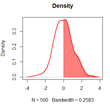
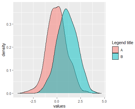
Density plot with ggplot2
You can create a density plot with R ggplot2 package. For that purpose, you can make use of the ggplot and geom_density functions as follows:
library(ggplot2)

df <- data.frame(x = x)

ggplot(df, aes(x = x)) +
       geom_density(color = "red", # Curve color
                    fill = "red",  # Area color
                    alpha = 0.5)   # Area transparency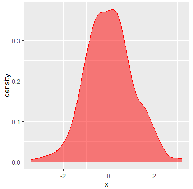
If you want to add more curves, you can set the X axis limits with xlim function and add a legend with the scale_fill_discrete as follows:
df <- data.frame(x = x, y = y)
df <- stack(df)

dx <- density(x)
dy <- density(y)

ggplot(df, aes(x = values, fill = ind)) +
       geom_density(alpha = 0.5) + # Densities with transparency
       xlim(c(min(dx$x, dy$x), # X-axis limits
            c(max(dx$x, dy$x)))) +
       scale_fill_discrete(name = "Legend title", # Change legend title
                           labels = c("A", "B")) # + # Change default legend labels
     # theme(legend.position = "none") # Delete legend


# Equivalent
ggplot(df, aes(x = values)) +
       geom_density(aes(group = ind, fill = ind), alpha = 0.5) +
       xlim(c(min(dx$x, dy$x), c(max(dx$x, dy$x)))) +
       scale_fill_discrete(name = "Legend title",
                           labels = c("A", "B"))