Line graphs in R
Lines graph, also known as line charts or line plots, display ordered data points connected with straight segments. In this tutorial you will learn how to plot line graphs in base R using the plot, lines, matplot, matlines and curve functions and how to modify the style of the resulting plots.
Drawing a line chart in R with the plot function
A line chart can be created in base R with the plot function. Consider that you have the data displayed on the table below:
| x | y |
|---|---|
| 1 | 200 |
| 2 | 400 |
| 3 | 600 |
| 4 | 700 |
| 5 | 500 |
You can plot the previous data using three different methods: specifying the two vectors, passing the data as data frame or with a formula. Note that we set type = “l” to connect the data points with straight segments.
# Data
x <- c(1, 2, 3, 4, 5)
y <- c(200, 300, 600, 700, 500)

# Vectors
plot(x, y, type = "l")

# Data frame
plot(data.frame(x, y), type = "l") # Equivalent

# Formula
plot(y ~ x, type = "l") # Equivalent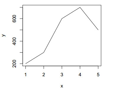
The style of the line graphs in R can be customized with the arguments of the function. As an example, the color and line width can be modified using the col and lwd arguments, respectively.
plot(x, y, type = "l",
     col = "lightblue", # Color
     lwd = 5)           # Line width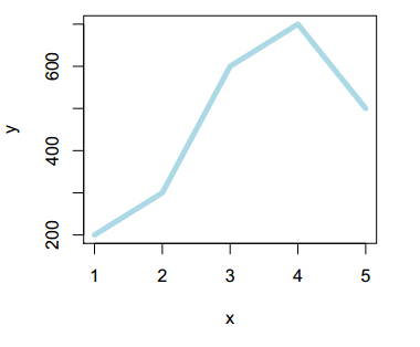
Line plot types
Besides type = “l”, there are three more types of line graphs available in base R. Setting type = “s” will create a stairs line graph, type = “b” will create a line plot with segments and points and type = “o” will also display segments and points, but with the line overplotted.
par(mfrow = c(1, 3))

plot(x, y, type = "s", main = 'type = "s"')
plot(x, y, type = "b", main = 'type = "b"')
plot(x, y, type = "o", main = 'type = "o"')

par(mfrow = c(1, 1))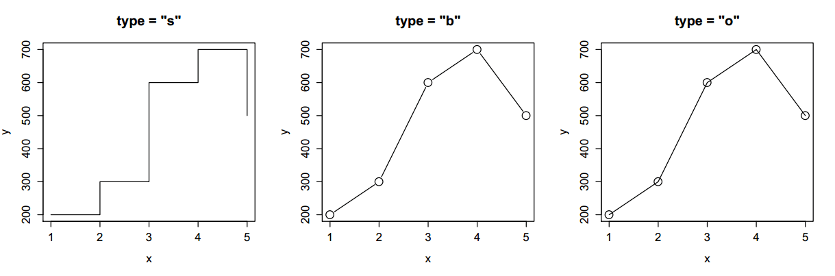
Furthermore, there exist six different types of lines, that can be specified making use of the lty argument, from 1 to 6:
par(mfrow = c(2, 3))

plot(x, y, type = "l", lwd = 2, lty = 1, main = "lty = 1")
plot(x, y, type = "l", lwd = 2, lty = 2, main = "lty = 2")
plot(x, y, type = "l", lwd = 2, lty = 3, main = "lty = 3")
plot(x, y, type = "l", lwd = 2, lty = 4, main = "lty = 4")
plot(x, y, type = "l", lwd = 2, lty = 5, main = "lty = 5")
plot(x, y, type = "l", lwd = 2, lty = 6, main = "lty = 6")

par(mfrow = c(1, 1))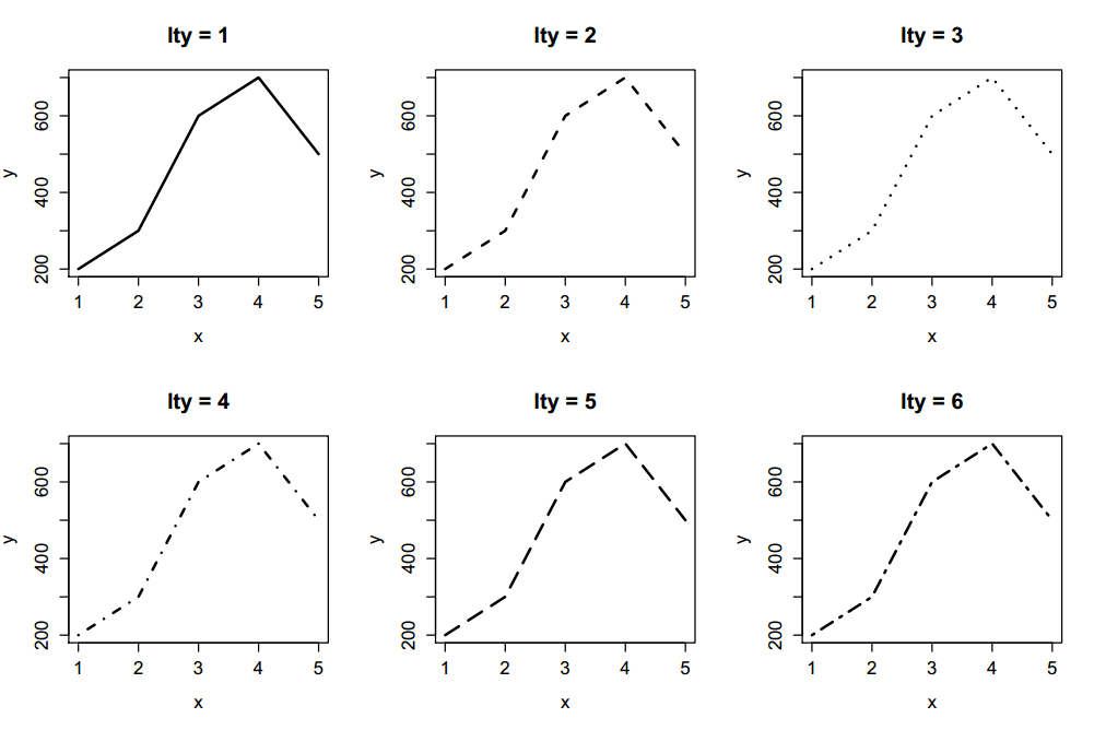
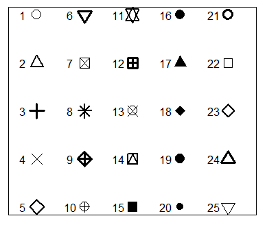
You can also customize the symbol used when type = “b” or type = “o”. These symbols, also known as pch symbols can be selected with the pch argument, that takes values from 0 (square) to 25. See pch symbols for more information. Some of the available symbols are the following:
The color of the symbol can be specified with the col argument, that will also modify the color of the line.
plot(x, y, type = "b", cex = 2, pch = 21, bg = "blue", col = "red")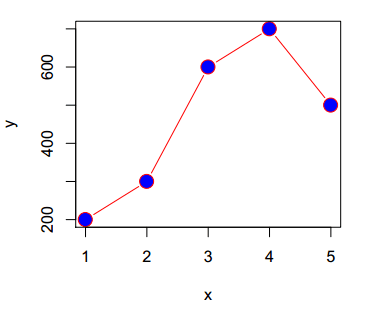
Symbols from 21 to 25 can be specified with a background color (different from the border), making use of the bg argument.
However, you can also add the points separately using the points function. This approach will allow you to customize all the colors as desired.
plot(x, y, type = "l", col = "red")

# Adding points
points(x, y,          # Coordinates
       pch = 21,      # Symbol
       cex = 2,       # Size of the symbol
       bg = "green",  # Background color of the symbol
       col = "blue",  # Border color of the symbol
       lwd = 3)       # Border width of the symbol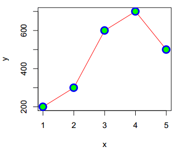
Note that the pch argument also allow to input characters, but only one. In the following example we are passing the first five letters of the alphabet.
plot(x, y, type = "b",
     pch = LETTERS[1:5], # Letters as symbols
     cex = 2,            # Size of the symbols
     col = 1:5,          # pch colors
     xlim = c(0, 6),     # X-axis limits
     ylim = c(150, 750)) # Y-axis limits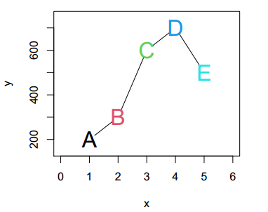
Adding text to the plot
In case you need to make some annotations to the chart you can use the text function, which first argument is the X coordinate, the second the Y coordinate and the third the annotation.
plot(x, y, type = "l")
text(x = 3, y = 650, "Custom annotation")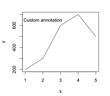
You can also specify a label for each point, passing a vector of labels.
labels <- c("Text 1", "Text 2", "Text 3", "Text 4", "Text 5")

plot(x, y, type = "l",
     xlim = c(0.5, 5.5), # X-axis limit
     ylim = c(150, 750)) # Y-axis limit
text(x = x, y = y, labels, col = "red")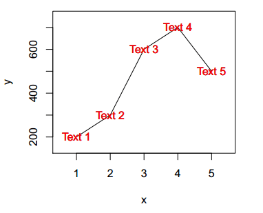
The curve function
In the previous section we reviewed how to create a line chart from two vectors, but in some scenarios you will need to create a line plot of a function. For that purpose you can use the curve function, specifying the function and the X-axis range with the arguments from and to.
curve(cos, from = 0, to = 10, ylab = "", main = "Sine and cosine")

# New curve over the first
curve(sin, from = 0, to = 10,
      col = 2,
      add = TRUE) # Needed to add the curve over the first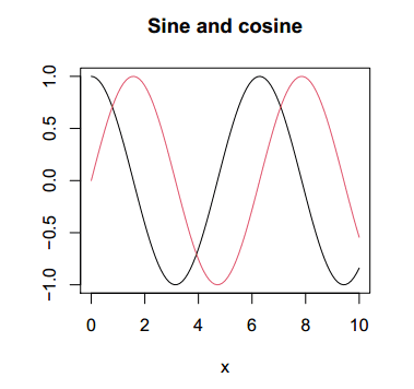
Note that you can also create a line plot from a custom function:
# Custom function
fun <- function(x){
    return(x ^ 3)
}

# Plot the custom function
curve(fun, from = -5, to = 5, ylab = expression(x^3),
      main = "curve function")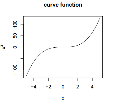
Line graph in R with multiple lines
If you have more variables you can add them to the same plot with the lines function. As an example, if you have other variable named y2, you can create a line graph with the two variables with the following R code:
# More data
y2 <- c(300, 400, 450, 400, 250)

# First line
plot(x, y, type = "l")

# Second line
lines(x, y2, type = "l", col = 2) # Same X values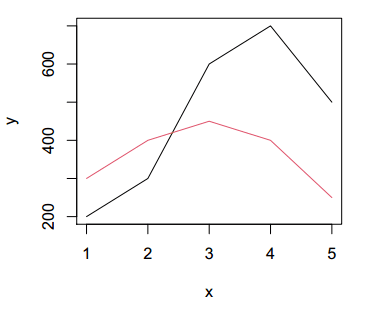
Note that the lines function is not designed to create a plot by itself, but to add a new layer over a already created plot.
The matplot and matlines functions
A better approach when dealing with multiple variables inside a data frame or a matrix is the matplot function. Considering that you have the following multivariate normal data:
# install.packages("MASS")
library(MASS) # For the mvrnorm function

set.seed(1)

# Multivariate normal data
means <- rep(0, 5)
variances <- matrix(1:25, ncol = 5)
data <- data.frame(mvrnorm(n = 10, mu = means, Sigma = variances))

# First six rows
head(data)
X1 X2 X3 X4 X5
1 0.9290410 -1.5584821 1.6540593 2.65356974 4.6452049
2 -0.1720333 -1.4431276 -0.8738552 -0.06321522 -0.8601666
3 0.6801899 2.2411593 3.7697473 3.34137647 3.4009497
4 -1.8517645 0.4274748 -3.5673172 -8.44912188 -9.2588224
5 -0.1966158 -1.7617016 -3.0887668 -0.01224664 -0.9830791
6 0.7674637 2.1241256 2.4990073 3.68081631 3.8373183You can plot all the columns at once with the function:
# Plot all columns at once
matplot(data, type = "l", main = "matplot function")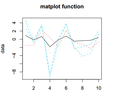
Equivalently to the lines function, matlines allows adding new lines to an existing plot. For instance, you can plot the first three columns of the data frame with the matplot function and then add the last two with matlines.
# Three first columns of the data frame
data1 <- data[, 1:3]

# Plot the three columns at once
matplot(data1, type = "l", lty = 1,
        ylab = "data",
        ylim = c(min(data), max(data))) # Y-axis limits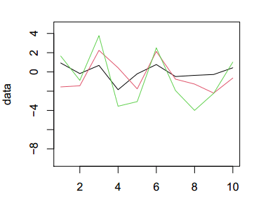
# Two last columns of the data frame
data2 <- data[, 4:5]

# Add the data to the previous plot
matlines(data2, type = "l", lty = 1, col = 4:5)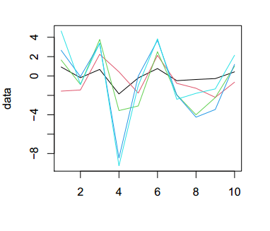
Line chart with categorical data
In addition to creating line charts with numerical data, it is also possible to create them with a categorical variable. Consider the following sample data:
# Data
data <- data.frame(group = as.factor(c("Group 1", "Group 2", "Group 3")),
                   var1 = c(1, 3, 2),
                   var2 = c(2, 1.5, 1.75))

head(data)
group var1 var2
1 Group 1 1 2.00
2 Group 2 3 1.50
3 Group 3 2 1.75If you want to plot the data as a line graph in R you can transform the factor variable into numeric with the is.numeric function and create the plot. You can set the factor variable on the X-axis or on the Y-axis:
par(mfrow = c(1, 2))

#-----------------
# Groups on X-axis
#-----------------
plot(as.numeric(data$group), data$var1, type = "l",
     ylab = "Value", xlab = "Group",
     xaxt = "n")

# Second variable
lines(as.numeric(data$group), data$var2, col = 2)

# Group names
axis(1, labels = as.character(data$group), at = as.numeric(data$group))

#-----------------
# Groups on Y-axis
#-----------------
plot(data$var1, as.numeric(data$group), type = "l",
     ylab = "Group", xlab = "Value",
     yaxt = "n")

# Second variable
lines(data$var2, as.numeric(data$group), col = 2)

# Group names
axis(2, labels = as.character(data$group), at = as.numeric(data$group))

par(mfrow = c(1, 1))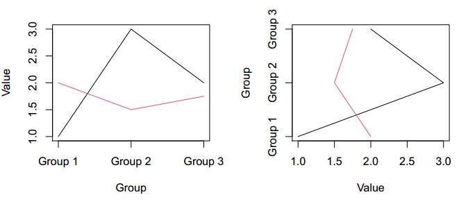
Line chart legend
The legend function allows adding legends in base R plots. You just need to specify the position or the coordinates, the labels of the legend, the line type and the color. You can also specify a pch symbol if needed.
plot(x = 1:10, y = 1:10, type = "l")
lines(x = 1:10, y = sqrt(1:10), col = 2, type = "l")

legend("topleft", legend = c("line 1", "line2"), lty = 1, col = 1:2)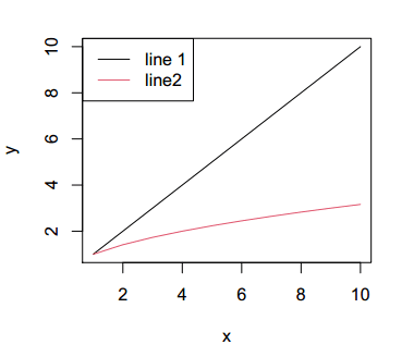
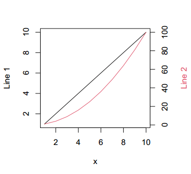
Line chart in R with two axes (dual axis)
Finally, it is important to note that you can add a second axis with the axis function as follows:
# Increase the plot margins
par(mar = c(5.25, 4.25, 4.25, 4.25))

# First line
plot(x = 1:10, y = 1:10, type = "l", xlab = "x", ylab = "Line 1")

# New plot (needed to merge both plots)
par(new = TRUE)

# Second line
plot(1:10, (1:10)^2, type = "l",
     col = 2,
     axes = FALSE, # No axes
     bty = "n",    # No box
     xlab = "", ylab = "")

# New axis
axis(4)
mtext("Line 2", side = 4, line = 3, col = 2)