Scatter plot in R

Scatter plots are dispersion graphs built to represent the data points of variables (generally two, but can also be three). The main use of a scatter plot in R is to visually check if there exist some relation between numeric variables.
How to make a scatter plot in R?
You can create scatter plot in R with the plot function, specifying the \(x\) values in the first argument and the \(y\) values in the second, being \(x\) and \(y\) numeric vectors of the same length. Passing these parameters, the plot function will create a scatter diagram by default. You can also specify the character symbol of the data points or even the color among other graphical parameters. You can review how to customize all the available arguments in our tutorial about creating plots in R.
Consider the model \(Y = 2 + 3X^2 + \varepsilon\), being \(Y\) the dependent variable, \(X\) the independent variable and \(\varepsilon\) an error term, such that \(X \sim U(0, 1)\) and \(\varepsilon \sim N(0, 0.25)\).
set.seed(12)

n <- 100
x <- runif(n)
eps <- rnorm(n, 0, 0.25)

y <- 2 + 3 * x^2 + eps
In order to plot the observations you can type:
plot(x, y, pch = 19, col = "black")
plot(y ~ x, pch = 19, col = "black") # Equivalent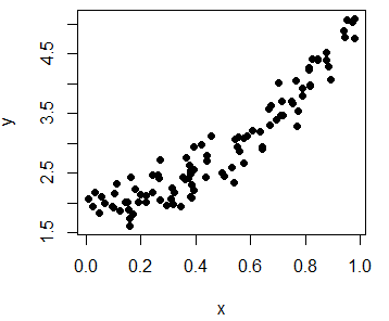
Moreover, you can use the identify function to manually label some data points of the plot, for example, some outliers. In the labels argument you can specify the labels you want for each point.
In this example we are going to identify the coordinates of the selected points. When done, you will have to press Esc. In case you need to look for more arguments or more detailed explanations of the function, type ?identify in the command console.
identify(y ~ x, labels = paste0("(", round(x, 2), ", ", round(y, 2), ")"))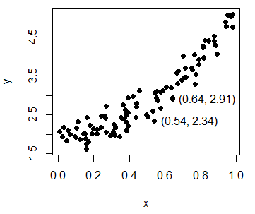
Scatter plot in R with different colors
If you have a variable that categorizes the data points in some groups, you can set it as parameter of the col argument to plot the data points with different colors, depending on its group, or even set different symbols by group.
group <- as.factor(ifelse(x < 0.5, "Group 1", "Group 2"))plot(x, y, pch = as.numeric(group), col = group)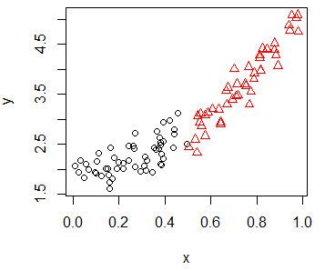
Scatter plot with regression line
As we said in the introduction, the main use of scatterplots in R is to check the relation between variables. For that purpose you can add regression lines (or add curves in case of non-linear estimates) with the lines function, that allows you to customize the line width with the lwd argument or the line type with the lty argument, among other arguments.
In this example, we are going to fit a linear and a non-parametric model with lm and lowess functions respectively, with default arguments.
plot(x, y, pch = 19, col = "gray52")

# Underlying model
lines(seq(0, 1, 0.05), 2 + 3 * seq(0, 1, 0.05)^2, col = "2", lwd = 3, lty = 2)

# Linear fit
abline(lm(y ~ x), col = "orange", lwd = 3)

# Smooth fit
lines(lowess(x, y), col = "blue", lwd = 3)

# Legend
legend("topleft", legend = c("Theoretical", "Linear", "Smooth"),
       lwd = 3, lty = c(2, 1, 1), col = c("red", "orange", "blue"))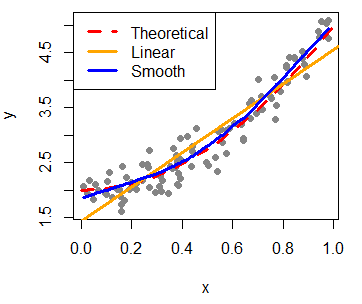
Furthermore, you can add the Pearson correlation coefficient between the variables that you can calculate with the cor function. Then, you can place the output at some coordinates of the plot with the text function.
# Calculate correlation
Corr <- cor(x, y)

# Create the plot and add the calculated value
plot(x, y, pch = 19)
text(paste("Correlation:", round(Corr, 2)), x = 0.2, y = 4.5)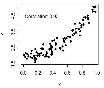
Add multiple series to R scatterplot
You can also add more data to your original plot with the points function, that will add the new points over the previous plot, respecting the original scale.
set.seed(1)

# Plot the first variable
plot(x, y, pch = 19)

# New variable
n <- 200
x2 <- runif(n)
y2 <- 2.5 + x2 + rnorm(n, 0, 0.1)

# Add new variable
points(x2, y2, col = "green", pch = 19)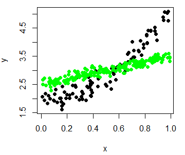
You could also append the data to the original dataset and categorize the data points in order to plot all at the same time and set different colors for each series.
Scatter plot with error bars in R
Adding error bars on a scatter plot in R is pretty straightforward. Consider you have 10 groups with Gaussian mean and Gaussian standard deviation as in the following example. You can plot the data and specify the limit of the Y-axis as the range of the lower and higher bar. Then, you will need to use the arrows function as follows to create the error bars.
my_data <- 1:10
Mean <- rnorm(10)
Sd <- rnorm(10, 1, 0.1)

plot(my_data, Mean,
     ylim = range(c(Mean - Sd, Mean + Sd)),
     pch = 16)

# Error bars
arrows(x0 = my_data, y0 = Mean - Sd, x1 = my_data, y1 = Mean + Sd,
       length = 0.15, code = 3, angle = 90)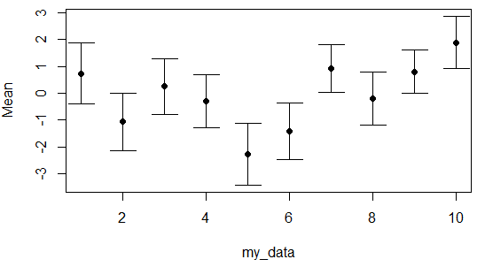
Connected scatterplot in R
A connected scatter plot is similar to a line plot, but the breakpoints are marked with dots or other symbol. For that purpose, you can set the type argument to "b" and specify the symbol you prefer with the pch argument.
Remember to use this kind of plot when it makes sense (when the variables you want to plot are properly ordered), or the results won’t be as expected.
set.seed(1)

x3 <- 0:10
y3 <- (0:10) ^ 1.45 + rnorm(11)
y4 <- (0:10) ^ 1.15 + rnorm(11)
y5 <- (0:10) ^ 1.05 + rnorm(11)

plot(x3, y3,  type = "b", col = 2 , lwd = 3, pch = 1)
lines(x3, y4, type = "b", col = 3 , lwd = 3, pch = 1)
lines(x3, y5, type = "b", col = 4 , lwd = 3, pch = 1)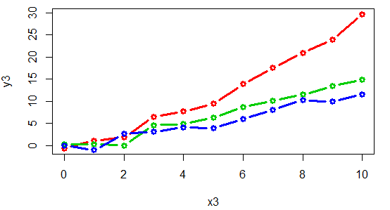
An alternative is to connect the points with arrows:
# Function to connect points with arrows
arrowsPlot <- function(x, y, lwd = 1, col = 1, angle = 20, length = 0.2) {
  invisible(sapply(1:length(x),
    function(i) arrows(x[i], y[i], x[i + 1], y[i + 1], lwd = lwd,
                       col = col, angle = angle, length = length)))
}

plot(x3, y3, col = 2, lwd = 3, pch = "")
arrowsPlot(x3, y3, col = 2, lwd = 3)

lines(x3, y4, col = 3, lwd = 3)
arrowsPlot(x3, y4, col = 3, lwd = 3)

lines(x3, y5, col = 4 , lwd = 3)
arrowsPlot(x3, y5, col = 4 , lwd = 3)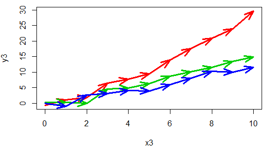
This type of plots are also interesting when you want to display the path that two variables draw over the time.
Consider, for instance, that you want to display the popularity of an artist against the albums sold over the time. You could plot something like the following:
# Sample data
x4 <- ifelse(x3 < 5, x3, rev(x3 / 3))
y5 <- ifelse(y3 < 5, y3 ^ 3, rev(y3 + 5))

# Creating the connected scatterplot
plot(x4, y5, yaxt = "n", xaxt = "n", pch = "",
     xlab = "Popularity", ylab = "Sells", xlim = c(-1, 5.5))
arrowsPlot(x4, y5, col = 3, lwd = 3)

# Adding the years to each point
text(x4 + 0.3, y5, 1970:1980)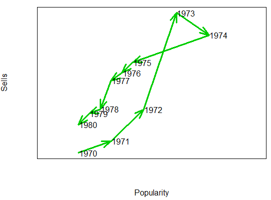
Smooth scatterplot with the smoothScatter function
The smoothScatter function is a base R function that creates a smooth color kernel density estimation of an R scatterplot.
The following examples show how to use the most basic arguments of the function. Note that, as other non-parametric methods, you will need to select a bandwidth. Although the function provides a default bandwidth, you can customize it with the bandwidth argument.
smoothScatter(x, y)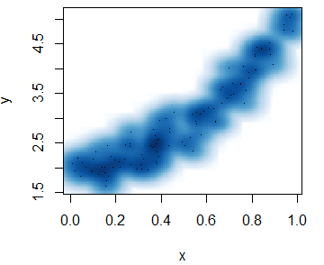
smoothScatter(x, y, pch = 19,
              transformation = function(x) x ^ 0.5, # Scale
              colramp = colorRampPalette(c("#f7f7f7", "aquamarine"))) # Colors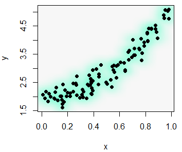
Heat map R scatter plot
With the smoothScatter function you can also create a heat map. For that purpose, you will need to specify a color palette as follows:
smoothScatter(x, y, transformation = function(x) x ^ 0.4,
              colramp = colorRampPalette(c("#000099", "#00FEFF", "#45FE4F",
                                           "#FCFF00", "#FF9400", "#FF3100")))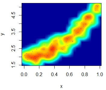
You can even add a contour with the contour function.
# install.packages("MASS")
library(MASS)
kern <- kde2d(x, y)

contour(kern, drawlabels = FALSE, nlevels = 6,
        col = rev(heat.colors(6)), add = TRUE, lwd = 3)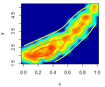
The scatterplot function in R
An alternative to create scatter plots in R is to use the scatterplot R function, from the car package, that automatically displays regression curves and allows you to add marginal boxplots to the scatter chart.
# install.packages("car")
library(car)

scatterplot(y ~ x)
scatterplot(x, y) # Equivalent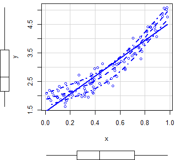
By default, the function plots three estimates (linear and non-parametric mean and conditional variance) with marginal boxplots and all with the same color.
In order to customize the scatterplot, you can use the col and pch arguments to change the points color and symbol, respectively. You can also pass arguments as list to the regLine and smooth arguments to customize the graphical parameters of the corresponding estimates.
scatterplot(x, y,
           col = 1,   # Change dots color
           pch = 15,  # Change symbols
           regLine = list(col = "green", # Linear regression line color
                          lwd = 3),      # Linear regression line width
           smooth = list(col.smooth = "red",   # Non-parametric mean color
                         col.spread = "blue")) # Non-parametric variance color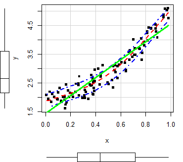
Moreover, in case you want to remove any of the estimates, set the corresponding argument to FALSE.
scatterplot(x, y,
            smooth = FALSE,  # Removes smooth estimate
            regLine = FALSE) # Removes linear estimate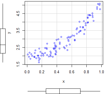
You can also set only one marginal boxplot with the boxplots argument, that defaults to "xy". If you set it to "x", only the boxplot of the X-axis will be displayed. The same for the Y-axis if you set the argument to "y". If you don’t want any boxplot, set it to "".
scatterplot(x, y,
            boxplots = "x") # Marginal boxplot for x-axis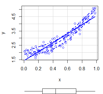
In case you have groups that categorize the data, you can create regression estimates for each group typing:
scatterplot(y ~ x | group)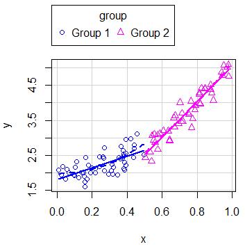
Note that you can disable the legend setting the legend argument to FALSE.
In addition, you can disable the grid of the plot or even add an ellipse with the grid and ellipse arguments, respectively.
scatterplot(x, y,
            boxplots = "",  # Disable boxplots
            grid = FALSE,   # Disable plot grid
            ellipse = TRUE) # Draw ellipses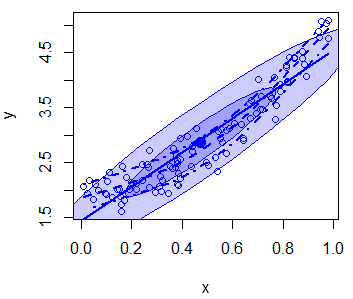
There are more arguments you can customize, so recall to type ?scatterplot for additional details.
Scatterplot matrix in R
When dealing with multiple variables it is common to plot multiple scatter plots within a matrix, that will plot each variable against other to visualize the correlation between variables. You can create a scatter plot in R with multiple variables, known as pairwise scatter plot or scatterplot matrix, with the pairs function.
pairs(~disp + wt + mpg + hp, data = mtcars)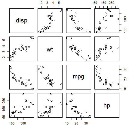
In addition, in case your dataset contains a factor variable, you can specify the variable in the col argument as follows to plot the groups with different color.
pairs(~disp + wt + mpg + hp, col = factor(mtcars$am), pch = 19, data = mtcars)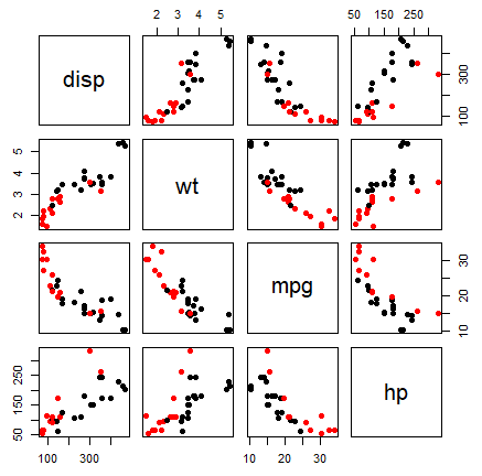
An alternative is to use the scatterplotMatrix function of the car package, that adds kernel density estimates in the diagonal.
install.packages("car")
library(car)

scatterplotMatrix(~ disp + wt + mpg + hp, data = mtcars)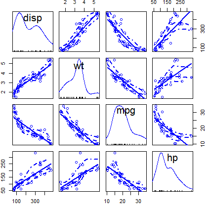
You can customize the colors of the previous plot with the corresponding arguments:
scatterplotMatrix(~ disp + wt + mpg + hp, data = mtcars,
                  diagonal = FALSE,             # Remove kernel density estimates
                  regLine = list(col = "green", # Linear regression line color
                                 lwd = 3),      # Linear regression line width
                  smooth = list(col.smooth = "red",   # Non-parametric mean color
                                col.spread = "blue")) # Non-parametric variance color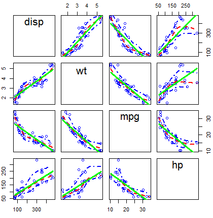
Other alternative is to use the cpairs function of the gclus package.
# install.packages("gclus")
library(gclus)
data <- mtcars[c(1, 3, 5, 6)] # Some numeric variables
# cpairs(data) # pairs() alternative

corr <- abs(cor(data)) # Correlation in absolute value
corr
colors <- dmat.color(corr)
order <- order.single(corr)

cpairs(data, order, panel.colors = colors, gap = 0.5,
       main = "Sorted and colored variables by correlation")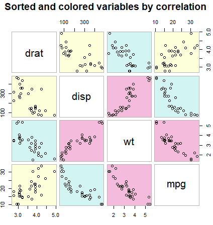
Scatter plot in ggplot2
Creating a scatter graph with the ggplot2 library can be achieved with the geom_point function and you can divide the groups by color passing the aes function with the group as parameter of the colour argument.
# install.packages("ggplot2")
library(ggplot2)

my_df <- data.frame(x = x, y = y, group = group)

ggplot(my_df, aes(x = x, y = y)) +
  geom_point(aes(colour = group)) + # Points and color by group
  scale_color_discrete("Groups") +  # Change legend title
  xlab("Variable X") +              # X-axis label
  ylab("Variable Y")  +             # Y-axis label
  theme(axis.line = element_line(colour = "black", # Changes the default theme
                                 size = 0.24))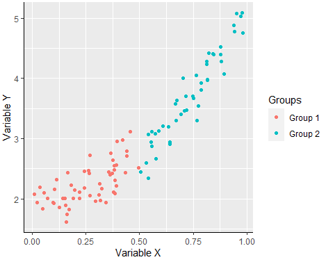
3D R scatterplot
With scatterplot3d and rgl libraries you can create 3D scatter plots in R. The scatterplot3d function allows to create a static 3D plot of three variables. You can see the full list of arguments running ?scatterplot3d.
# install.packages("scatterplot3d")
library(scatterplot3d)

set.seed(2)
x <- rnorm(1000)
y <- rnorm(1000)
z <- rnorm(1000)

scatterplot3d(x, y, z, pch = 19, color = "blue")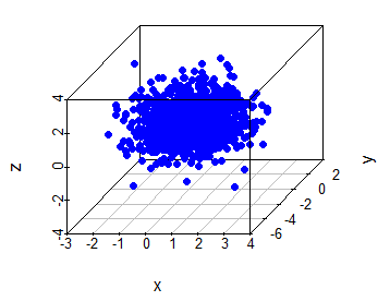
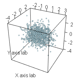
An alternative is to use the plot3d function of the rgl package, that allows an interactive visualization. You can rotate, zoom in and zoom out the scattergram. This is very useful when looking for patterns in three-dimensional data.
# install.packages("rgl")
library(rgl)

plot3d(x, y, z,      # Data
       type = "s",   # Type of the plot
       radius = 0.1, # Radius of the observations
       col = "lightblue",   # Color of the observations
       xlab ="X axis lab",  # Label of the X axis
       ylab = "Y axis lab", # Label of the Y axis
       zlab = "Z axis lab") # Label of the Z axis