Plot in R

The most basic graphics function in R is the plot function. This function has multiple arguments to configure the final plot: add a title, change axes labels, customize colors, or change line types, among others. In this tutorial you will learn how to plot in R and how to fully customize the resulting plot.
Plot function in R
The R plot function allows you to create a plot passing two vectors (of the same length), a dataframe, matrix or even other objects, depending on its class or the input type. We are going to simulate two random normal variables called x and y and use them in almost all the plot examples.
set.seed(1)

# Generate sample data
x <- rnorm(500)
y <- x + rnorm(500)
You can create a plot of the previous data typing:
# Plot the data
plot(x, y)

# Equivalent
M <- cbind(x, y)
plot(M)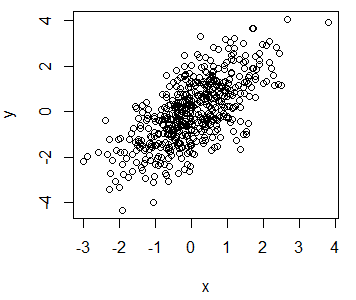
With the plot function you can create a wide range of graphs, depending on the inputs. In the following table we summarize all the available possibilities for the base R plotting function.
| Function and arguments | Output plot |
|---|---|
| plot(x, y) | Scatterplot of x and y numeric vectors |
| plot(factor) | Barplot of the factor |
| plot(factor, y) |
Boxplot of the numeric vector and the levels of the factor |
| plot(time_series) | Time series plot |
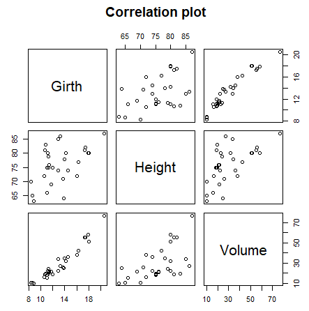
| plot(data_frame) |
Correlation plot of all dataframe columns (more than two columns) |
| plot(date, y) | Plots a date-based vector |
| plot(function, lower, upper) |
Plot of the function between the lower and maximum value specified |
If you execute the following code you will obtain the different plot examples.
# Examples

par(mfrow = c(2, 3))

# Data
my_ts <- ts(matrix(rnorm(500), nrow = 500, ncol = 1),
              start = c(1950, 1), frequency = 12)

my_dates <- seq(as.Date("2005/1/1"), by = "month", length = 50)

my_factor <- factor(mtcars$cyl)

fun <- function(x) x^2

# Scatterplot
plot(x, y, main = "Scatterplot")

# Barplot
plot(my_factor, main = "Barplot")

# Boxplot
plot(my_factor, rnorm(32), main = "Boxplot")

# Time series plot
plot(my_ts, main = "Time series")

# Time-based plot
plot(my_dates, rnorm(50), main = "Time based plot")

# Plot R function
plot(fun, 0, 10, main = "Plot a function")

# Correlation plot
plot(trees[, 1:3], main = "Correlation plot")

par(mfrow = c(1, 1))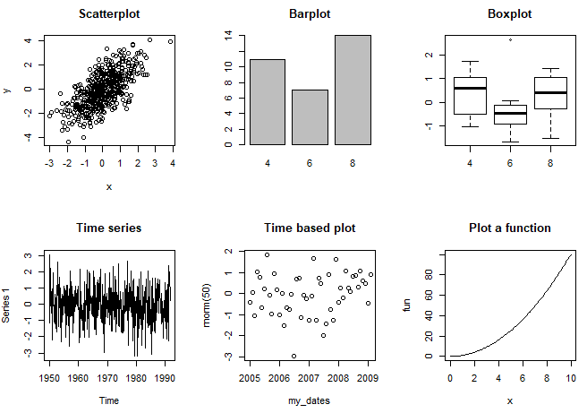
When you create several plots in R GUI (not in RStudio), the next plot will override the previous. However, you can create new plot windows with windows, X11 and quartz functions depending on your operating system, to solve this issue.
R window
When creating plots in base R they will be opened in a new window. However, you may need to customize the height and width of the window, that defaults to 7 inches (17.78 cm). For that purpose, you can use of the height and width arguments of the following functions, depending on your system.
It should be noted that in RStudio the graph will be displayed in the pane layout but if you use the corresponding function, the graph will open in a new window, just like in base R.
windows() # Windows
X11()     # Unix
quartz()  # Mac
In addition to being able to open and set the size of the window, this functions are used to avoid overriding the plots you create, as when creating a new plot you will lose the previous. Note that in RStudio you can navigate through all the plots you created in your session in the plots pane.
# First plot will open
# a new window
plot(x, y)

# New window
windows()

# Other plot in new window
plot(x, x)
You can also clear the plot window in R programmatically with dev.off function, to clear the current window and with graphics.off, to clear all the plots and restore the default graphic parameters.
# Clear the current plot
dev.off()

# Clear all the plots
graphics.off()
while (dev.cur() > 1) dev.off() # Equivalent
Note that the dev.cur function counts the number of current available graphics devices.
R plot type
You can also customize the plot type with the type argument. The selection of the type will depend on the data you are plotting. In the following code block we show the most popular plot types in R.
j <- 1:20
k <- j

par(mfrow = c(1, 3))

plot(j, k, type = "l", main = "type = 'l'")
plot(j, k, type = "s", main = "type = 's'")
plot(j, k, type = "p", main = "type = 'p'")

par(mfrow = c(1, 1))

par(mfrow = c(1, 3))

plot(j, k, type = "l", main = "type = 'o'")
plot(j, k, type = "s", main = "type = 'b'")
plot(j, k, type = "p", main = "type = 'h'")

par(mfrow = c(1, 1))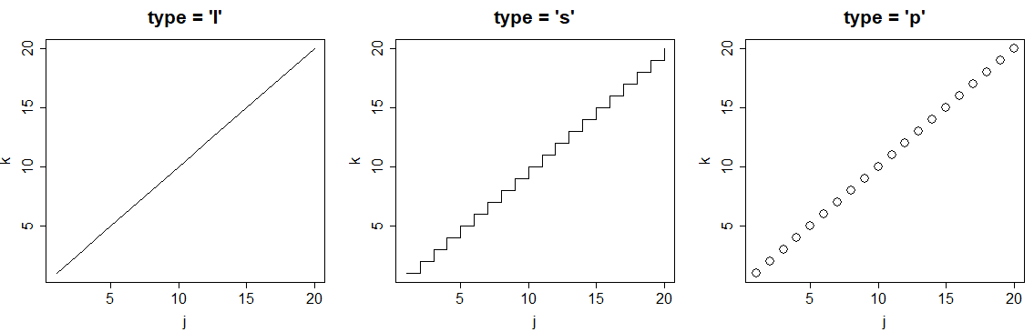
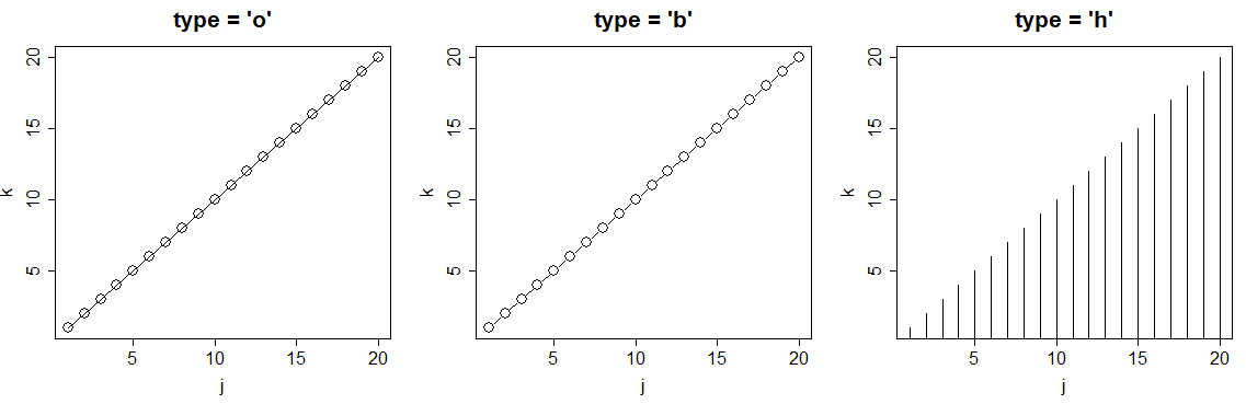
| Plot type | Description |
|---|---|
| p | Points plot (default) |
| l | Line plot |
| b | Both (points and line) |
| o | Both (overplotted) |
| s | Stairs plot |
| h | Histogram-like plot |
| n | No plotting |
R plot pch
The pch argument allows to modify the symbol of the points in the plot. The main symbols can be selected passing numbers 1 to 25 as parameters. You can also change the symbols size with the cex argument and the line width of the symbols (except 15 to 18) with the lwd argument.
r <- c(sapply(seq(5, 25, 5), function(i) rep(i, 5)))
t <- rep(seq(25, 5, -5), 5)

plot(r, t, pch = 1:25, cex = 3, yaxt = "n", xaxt = "n",
     ann = FALSE, xlim = c(3, 27), lwd = 1:3)
text(r - 1.5, t, 1:25)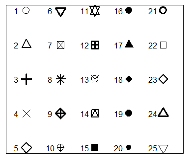
Note that symbols 21 to 25 allow you to set border width and also background color with the lwd and bg arguments, respectively.
plot(r, t, pch = 21:25, cex = 3, yaxt = "n", xaxt = "n", lwd = 3,
     ann = FALSE, xlim = c(3, 27), bg = 1:25, col = rainbow(25))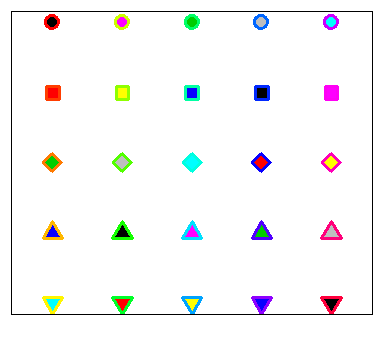
In the following block of code we show a simple example of how to customize one of these symbols.
# Example

plot(x, y, pch = 21,
     bg = "red",   # Fill color
     col = "blue", # Border color
     cex = 3,      # Symbol size
     lwd = 3)      # Border width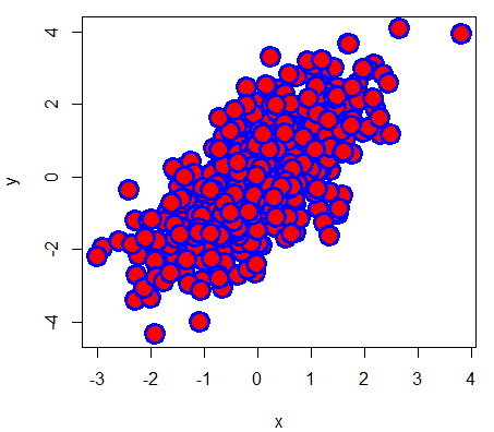
It is worth to mention that you can use any character as symbol. In fact, some character symbols can be selected using numbers 33 to 240 as parameter of the pch argument.
# Custom symbols
plot(1:5, 1:5, pch = c("☺", "❤", "✌", "❄", "✈"),
     col = c("orange", 2:5), cex = 3,
     xlim = c(0, 6), ylim = c(0, 6))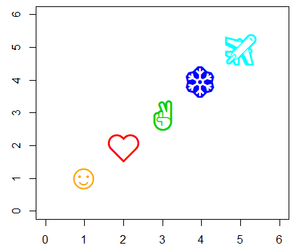
R plot title
The title can be added to a plot with the main argument or the title function.
plot(x, y, main = "My title")

# Equivalent
plot(x, y)
title("My title")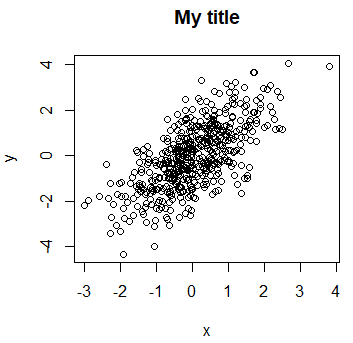
The main difference between using the title function or the argument is that the arguments you pass to the function only affect the title.
In order to change the plot title position you can set the adj argument with a value between 0 (left) and 1 (right) and the line argument, where values greater than 1.7 (default) move the title up and values lower than 1.7 to move it down. Negative values of line will make the title go inside the plot. It should be noted that if you set this arguments to the plot function, the changes will be applied to all texts.
plot(x, y)
title("My title",
      adj = 0.75,  # Title to the right
      line = 0.25)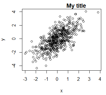
LaTeX in plot title
It is very common for data scientists the need of display mathematical expressions in the title of the plots. For that purpose, you can use the expression function. You can look for all the available options for using LaTeX-like mathematical notation calling ?plotmath.
plot(x, y, main = expression(alpha[1] ^ 2 + frac(beta, 3)))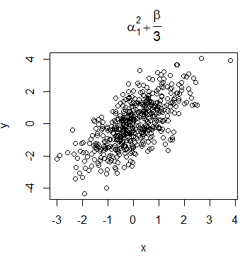
Nevertheless, the syntax of the function is quite different from LaTeX syntax. If you prefer, you can use the TeX function of the latex2exp package. However, note that this function translates TeX notation to expression function notation, so the symbols and notation available are the same in both functions.
# install.packages("latex2exp")
library(latex2exp)

plot(x, y, main = TeX('$\beta^3, \beta \in 1 \ldots 10$'))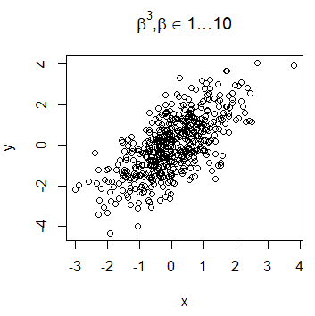
The LaTeX expressions can be used also in the subtitle, axis labels or any other place, as text added to the plot.
Subtitle in R plot
Furthermore, you can add a subtitle to a plot in R with the sub argument, that will be displayed under the plot. It is possible to add a subtitle even if you don’t specify a title.
plot(x, y, main = "My title", sub = "My subtitle")

# Equivalent
plot(x, y)
title(main = "My title", sub = "My subtitle")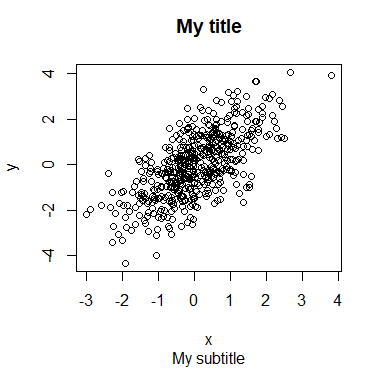
Axis in R
In R plots you can modify the Y and X axis labels, add and change the axes tick labels, the axis size and even set axis limits.
R plot x and y labels
By default, R will use the vector names of your plot as X and Y axes labels. However, you can change them with the xlab and ylab arguments.
plot(x, y, xlab = "My X label", ylab = "My Y label")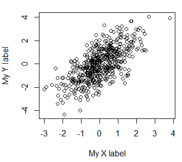
If you want to delete the axes labels you can set them to a blank string or set the ann argument to FALSE.
# Delete labels
plot(x, y, xlab = "", ylab = "")

# Equivalent
plot(x, y, xlab = "My X label", ylab = "My Y label", ann = FALSE)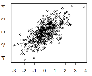
R axis function
The argument axes of the plot function can be set to FALSE in order to avoid displaying the axes, so in case you want, you can add only one of them with the axis function and customize it. Passing a 1 as argument will plot the X-axis, passing 2 will plot the Y-axis, 3 is for the top axis and 4 for the right axis.
plot(x, y, axes = FALSE)

# Add X-axis
axis(1)

# Add Y-axis
axis(2)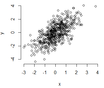
Change axis tick-marks
It is also possible to change the tick-marks of the axes. On the one hand, the at argument of the axis function allows to indicate the points at which the labels will be drawn.
plot(x, y, axes = FALSE)
axis(1, at = -2:2)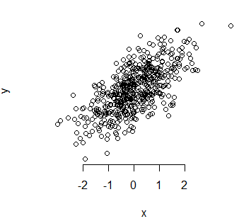
On the other hand, the minor.tick function of the Hmisc package allows you to create smaller tick-marks between the main ticks.
# install.packages("Hmisc")
library(Hmisc)

plot(x, y)
minor.tick(nx = 3, ny = 3, tick.ratio = 0.5)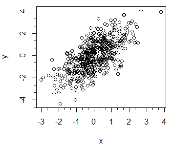
Finally, you could create interior ticks specifying a positive number in the tck argument as follows:
# Interior ticks
plot(x, y, tck = 0.02)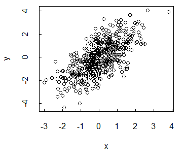
Remove axis tick labels
Setting the arguments xaxt or yaxt to "n" of the plot function will avoid plotting the X and Y axis labels, respectively.
par(mfrow = c(1, 3))

# Remove X axis tick labels
plot(x, y, xaxt = "n", main = "xaxt = 'n'")

# Remove Y axis tick labels
plot(x, y, yaxt = "n", main = "yaxt = 'n'")

# Remove both axis tick labels
plot(x, y, yaxt = "n", xaxt = "n", main = "xaxt = 'n', yaxt = 'n'")

par(mfrow = c(1, 1))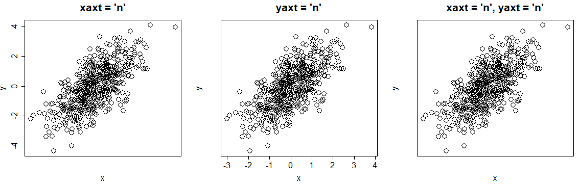
Change axis tick labels
The axes tick labels will be numbered to follow the numeration of your data. Nevertheless, you can modify the tick labels, if needed, with the labels argument of the axis function. You will also have to specify where the tick labels will be displayed with the at argument.
par(mfrow = c(1, 2))

# Change X axis tick labels
plot(x, y, xaxt = "n")
axis(1, at = seq(round(min(x)), round(max(x)), by = 1), labels = 1:8)

# Change Y axis tick labels
plot(x, y, yaxt = "n")
axis(2, at = seq(round(min(y)), round(max(y)), by = 1), labels = 1:9)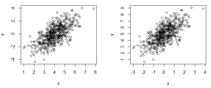
Rotate axis labels
The las argument of the plot function in R allows you to rotate the axes labels of your plots. In the following code block you will find the explanation of the different alternatives.
par(mfrow = c(2, 2))

plot(x, y, las = 0, main = "Parallel")      # Parallel to axis (default)
plot(x, y, las = 1, main = "Horizontal")    # Horizontal
plot(x, y, las = 2, main = "Perpendicular") # Perpendicular to axis
plot(x, y, las = 3, main = "Vertical")      # Vertical

par(mfrow = c(1, 1))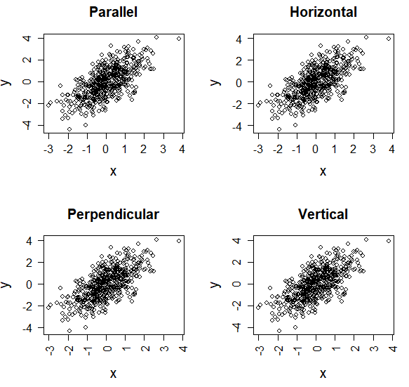
Set axis limits
You can zoom in or zoom out the plot changing R plot axes limits. These arguments are very useful to avoid cropping lines when you add them to your plot.
plot(x, y,
     ylim = c(-8, 8), # Y-axis limits from -8 to 8
     xlim = c(-5, 5)) # X-axis limits from -5 to 5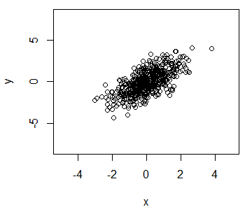
Change axis scale in R
The log argument allows changing the scale of the axes of a plot. You can transform the X-axis, the Y-axis or both as follows:
# New data to avoid negative numbers
s <- 1:25
u <- 1:25

par(mfrow = c(2, 2))

# Default
plot(s, u, pch = 19,
     main = "Untransformed")

# Log scale. X-axis
plot(s, u, pch = 19, log = "x",
     main = "X-axis transformed")

# Log scale. Y-axis
plot(s, u, pch = 19, log = "y",
     main = "Y-axis transformed")

# Log scale. X and Y axis
plot(s, u, pch = 19, log = "xy",
     main = "Both transformed")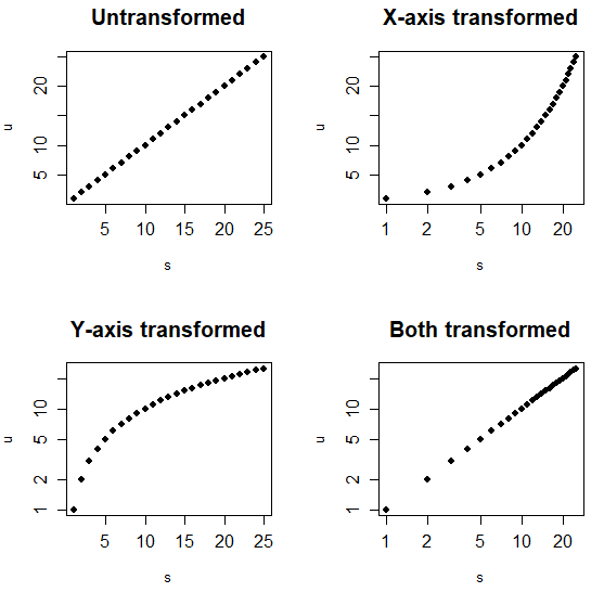
| Log | Transformation |
|---|---|
| “x” | X-axis transformed |
| “y” | Y-axis transformed |
| “xy” | Both axis transformed |
However, you may be thinking that using the log function is equivalent but is not. As you can see in the previous plot, using the log argument doesn’t modify the data, but the log function will transform it. Look at the difference between the axes of the following graph and those of the previous one.
par(mfrow = c(1, 3))

# Log-log
plot(log(s), log(u), pch = 19,
     main = "log-log")
# log(x)
plot(log(s), u, pch = 19,
     main = "log(x)")
# log(y)
plot(s, log(u), pch = 19,
     main = "log(y)")

par(mfrow = c(1, 1))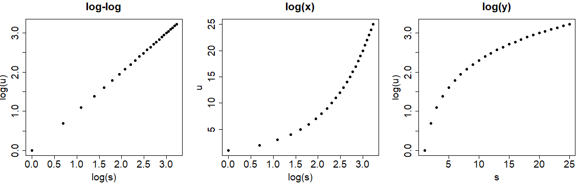
R plot font
Font size
You can also change the font size in an R plot with the cex.main, cex.sub, cex.lab and cex.axis arguments to change title, subtitle, X and Y axis labels and axes tick labels, respectively. Note that greater values will display larger texts.
plot(x, y, main = "My title", sub = "Subtitle",
     cex.main = 2,   # Title size
     cex.sub = 1.5,  # Subtitle size
     cex.lab = 3,    # X-axis and Y-axis labels size
     cex.axis = 0.5) # Axis labels size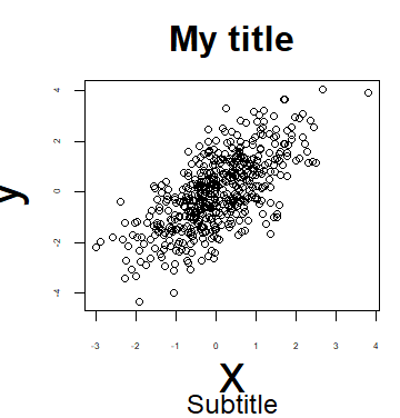
| Argument | Description |
|---|---|
| cex.main | Sets the size of the title |
| cex.sub | Sets the size of the subtitle |
| cex.lab | Sets the X and Y axis labels size |
| cex.axis | Sets the tick axis labels size |
Font style
Furthermore, you can change the font style of the R plots with the font argument. You can set this argument to 1 for plain text, 2 to bold (default), 3 italic and 4 for bold italic text. This argument won’t modify the title style.
par(mfrow = c(1, 3))

plot(x, y, font = 2, main = "Bold") # Bold
plot(x, y, font = 3, main = "Italics") # Italics
plot(x, y, font = 4, main = "Bold italics") # Bold italics

par(mfrow = c(1, 1))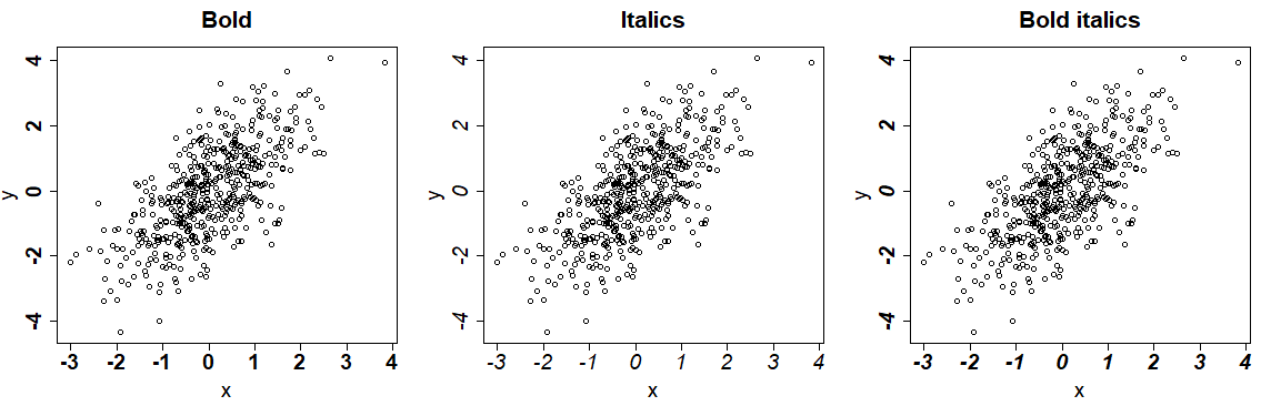
You can also specify the style of each of the texts of the plot with the font.main, font.sub, font.axis and font.lab arguments.
plot(x, y,
     main = "My title",
     sub = "Subtitle",
     font.main = 1, # Title font style
     font.sub  = 2, # Subtitle font style
     font.axis = 3, # Axis tick labels font style
     font.lab  = 4) # Font style of X and Y axis labels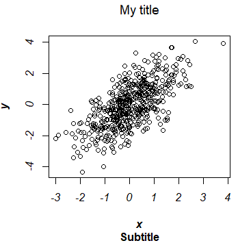
Note that, by default, the title of a plot is in bold.
| Font style | Description |
|---|---|
| 1 | Plain text |
| 2 | Bold |
| 3 | Italic |
| 4 | Bold italic |
Font family
The family argument allows you to change the font family of the texts of the plot. You can even add more text with other font families. Note that you can see the full list of available fonts in R with the names(pdfFonts()) command, but some of them may be not installed on your computer.
# All available fonts
names(pdfFonts())

plot(x, y, family = "mono")
text(-2, 3, "Some text", family = "sans")
text(-2, 2, "More text", family = "serif")
text(1, -4, "Other text", family = "HersheySymbol")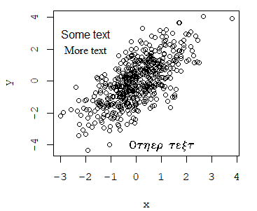
An alternative is to use the extrafont package.
# install.packages("extrafont")
library(extrafont)

# Auto detect the available fonts in your computer
# This can take several minutes to run
font_import()

# Font family names
fonts()

# Data frame containing the font family names
fonttable()
R plot color
In the section about pch symbols we explained how to set the col argument, that allows you to modify the color of the plot symbols. In R, there is a wide variety of color palettes. With the colors function you can return all the available base R colors. Furthermore, you could use the grep function (a regular expression function) to return a vector of colors containing some string.
# Return all colors
colors()

# Return all colors that contain the word 'green'
cl <- colors()
cl[grep("green", cl)]

# Plot with blue dots
plot(x, y, col = "blue")
plot(x, y, col = 4) # Equivalent
plot(x, y, col = "#0000FF") # Equivalent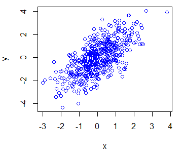
You can specify colors with its name ("red", "green", …), with numbers (1 to 8) or even with its HEX reference ("#FF0000", "#0000FF", …).
You can also modify the text colors with the col.main, col.sub, col.lab and col.axis functions and even change the box color with the fg argument.
plot(x, y, main = "Title", sub = "Subtitle",
    pch  = 16,
    col = "red",            # Symbol color
    col.main = "green",     # Title color
    col.sub = "blue",       # Subtitle color
    col.lab = "sienna2",    # X and Y-axis labels color
    col.axis = "maroon4",   # Tick labels color
    fg = "orange")          # Box color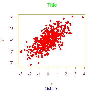
Plot color points by group
If you have numerical variables labelled by group, you can plot the data points separated by color, passing the categorical variable (as factor) to the col argument. The colors will depend on the factors.
# Create dataframe with groups
group <- ifelse(x < 0 , "car", ifelse(x > 1, "plane", "boat"))
df <- data.frame(x = x, y = y, group = factor(group))

# Color by group
plot(df$x, df$y, col = df$group, pch = 16)

# Change group colors
colors <- c("red", "green", "blue")
plot(df$x, df$y, col = colors[df$group], pch = 16)

# Change color order, changing levels order
plot(df$x, df$y, col = colors[factor(group, levels = c("car", "boat", "plane"))],
     pch = 16)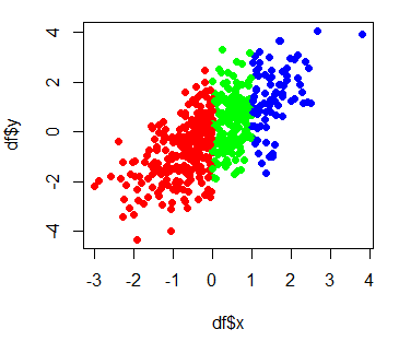
Note that, by default, factor levels are ordered alphabetically, so in this case the order of the colors vector is not the order of the colors in the plot, as the first row of the dataframe corresponds to “car”, that is the second level. Hence, if you change the levels order, you can modify the colors order.
Since R 4.0.0 the stringAsFactors argument of the data.frame function is FALSE by default, so you will need to transform the categorical variable into a factor to color the observations by group as in the previous example.
Background color
There are two ways to change the background color of R charts: changing the entire color, or changing the background color of the box. To change the full background color you can use the following command:
# Light gray background color
par(bg = "#f7f7f7")

# Add the plot
plot(x, y, col = "blue", pch = 16)

# Back to the original color
par(bg = "white")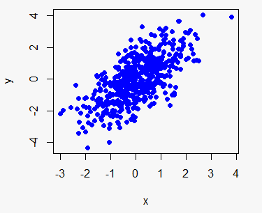
However, the result will be more beautiful if only the box is colored in a certain color, although this requires more code. Note that the plot.new function allows you to create an empty plot in R and that par (new = TRUE) allows you to add one graph over another.
# Create an empty plot
plot.new()

rect(par("usr")[1], par("usr")[3],
     par("usr")[2], par("usr")[4],
     col = "#f7f7f7") # Color

par(new = TRUE)

plot(x, y, col = "blue", pch = 16)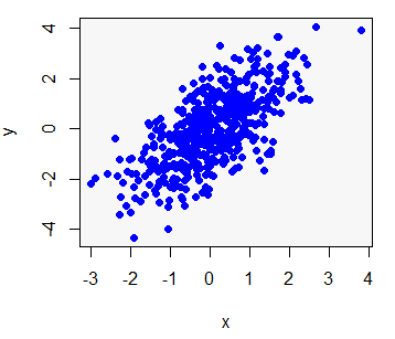
R plot line
You can add a line to a plot in R with the lines function. Consider, for instance, that you want to add a red line to a plot, from (-4, -4) to (4, 4), so you could write:
plot(x, y)
lines(-4:4, -4:4, lwd = 3, col = "red")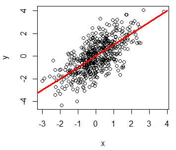
R plot line width
The line width in R can be changed with the lwd argument, where bigger values will plot a wider line.
M <- matrix(1:36, ncol = 6)

matplot(M, type = c("l"), lty = 1, col = "black", lwd = 1:6)

# Just to indicate the line widths in the plot
j <- 0
invisible(sapply(seq(4, 40, by = 6),
                 function(i) {
                   j <<- j + 1
                   text(2, i, paste("lwd =", j))}))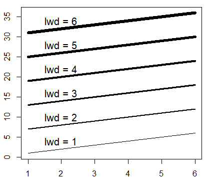
Plot line type
When plotting a plot of type “l”, “o”, “b”, “s”, or when you add a new line over a plot, you can choose between different line types, setting the lty argument from 0 to 6.
matplot(M, type = c("l"), lty = 1:6, col = "black", lwd = 3)

# Just to indicate the line types in the plot
j <- 0
invisible(sapply(seq(4, 40, by = 6),
                 function(i) {
                   j <<- j + 1
                   text(2, i, paste("lty =", j))}))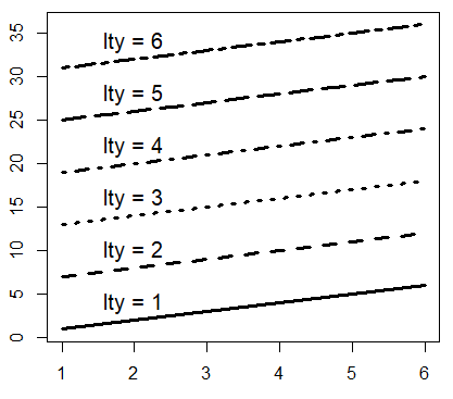
| Type | Description |
|---|---|
| 0 | Blank |
| 1 | Solid line (default) |
| 2 | Dashed line |
| 3 | Dotted line |
| 4 | Dotdash line |
| 5 | Longdash line |
| 6 | Twodash line |
Add text to plot in R
On the one hand, the mtext function in R allows you to add text to all sides of the plot box. There are 12 combinations (3 on each side of the box, as left, center and right align). You just need to change the side and adj to obtain the combination you need.
On the other, the text function allows you to add text or formulas inside the plot at some position setting the coordinates. In the following code block some examples are shown for both functions.
plot(x, y, main = "Main title", cex = 2, col = "blue")

#---------------
# mtext function
#---------------

# Bottom-center
mtext("Bottom text", side = 1)

# Left-center
mtext("Left text", side = 2)

# Top-center
mtext("Top text", side = 3)

# Right-center
mtext("Right text", side = 4)


# Bottom-left
mtext("Bottom-left text", side = 1, adj = 0)

# Top-right
mtext("Top-right text", side = 3, adj = 1)


# Top with separation
mtext("Top higher text", side = 3, line = 2.5)

#--------------
# Text function
#--------------

# Add text at coordinates (-2, 2)
text(-2, 2, "More text")

# Add formula at coordinates (3, -3)
text(3, -3, expression(frac(alpha[1], 4)))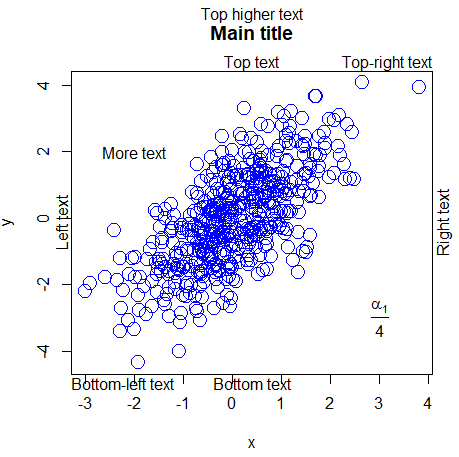
Label points in R
In this section you will learn how to label data points in R. For that purpose, you can use the text function, indicate the coordinates and the label of the data points in the labels argument. With the pos argument you can set the position of the label respect to the point, being 1 under, 2 left, 3 top and 4 right.
attach(USJudgeRatings)

# Create the plot
plot(FAMI, INTG,
     main = "Familiarity with law vs Judicial integrity",
     xlab = "Familiarity", ylab = "Integrity",
     pch = 18, col = "blue")

# Plot the labels
text(FAMI, INTG,
     labels = row.names(USJudgeRatings),
     cex = 0.6, pos = 4, col = "red")

detach(USJudgeRatings)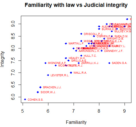
You can also label individual data points if you index the elements of the text function as follows:
attach(USJudgeRatings)

plot(FAMI, INTG,
     main = "Familiarity with law vs Judicial integrity",
     xlab = "Familiarity", ylab = "Integrity",
     pch = 18, col = "blue")

# Select the index of the elements to be labelled
selected <- c(10, 15, 20)

# Index the elements with the vector
text(FAMI[selected], INTG[selected],
     labels = row.names(USJudgeRatings)[selected],
     cex = 0.6, pos = 4, col = "red")

detach(USJudgeRatings)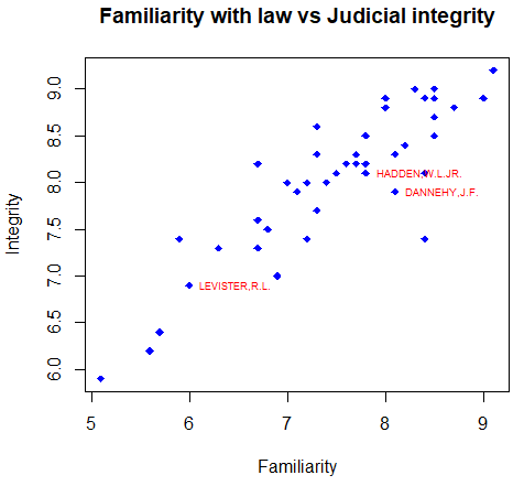
Change box type with bty argument
The bty argument allows changing the type of box of the R graphs. There are several options, summarized in the following table:
| Box type | Description |
|---|---|
| “o” | Entire box (default) |
| “7” | Top and right |
| “L” | Left and bottom |
| “U” | Left, bottom and right |
| “C” | Top, left and bottom |
| “n” | No box |
The shape of the characters “7”, “L” and “U” represents the borders of the box they draw.
par(mfrow = c(2, 3))

plot(x, y, bty = "o", main = "Default")
plot(x, y, bty = "7", main = "bty = '7'")
plot(x, y, bty = "L", main = "bty = 'L'")
plot(x, y, bty = "U", main = "bty = 'U'")
plot(x, y, bty = "C", main = "bty = 'C'")
plot(x, y, bty = "n", main = "bty = 'n'")

par(mfrow = c(1, 1))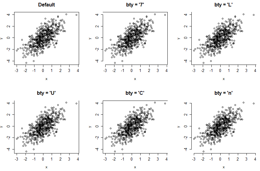
Note that in other plots, like boxplots, you will need to specify the bty argument inside the par function.
R plot legend
Finally, we will review how to add a legend to an R plot with the legend function. You can set the coordinates where you want to add the legend or specify "top", "bottom", "topleft", "topright", "bottomleft" or "bottomright". You can also specify lots of arguments like in the plot function. As an example, you can change the bty in the R legend, the background color with the bg argument, among others.
plot(x, y, pch = 19)
lines(-4:4, -4:4, lwd = 3, col = "red")
lines(-4:1, 0:5, lwd = 3, col = "green")

# Adding a legend
legend("bottomright", legend = c("red", "green"),
       lwd = 3, col = c("red", "green"))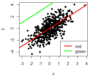
Take a look to the R legends article to learn more about how to add legends to the plots.