Histogram in R

A histogram is the most usual graph to represent continuous data. It is a bar plot that represents the frequencies at which they appear measurements grouped at certain intervals and count how many observations fall at each interval. Moreover, the height is determined by the rate between the frequency and the width of the interval. In this tutorial we will review how to create a histogram in R programming language.
How to make a histogram in R? The R hist function
If you are reading this you are wondering how to plot a histogram in R. So in order to explain the steps to create a histogram in R, we are going to use the following data, that represents the distance (in yards) of a golf ball after being hit.
distance <- c(241.1, 284.4, 220.2, 272.4, 271.1, 268.3,
              291.6, 241.6, 286.1, 285.9, 259.6, 299.6,
              253.1, 239.6, 277.8, 263.8, 267.2, 272.6,
              283.4, 234.5, 260.4, 264.2, 295.1, 276.4,
              263.1, 251.4, 264.0, 269.2, 281.0, 283.2)
You can plot a histogram in R with the hist function. By default, the function will create a frequency histogram.
# Frequency
hist(distance, main = "Frequency histogram")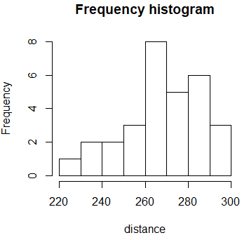
However, if you set the argument prob to TRUE, you will get a density histogram.
 # Density
hist(distance,
     prob = TRUE,
     main = "Density histogram")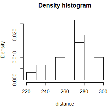
In addition, you can also add a grid to the histogram with the grid function as follows:
hist(distance, prob = TRUE)
grid(nx = NA, ny = NULL, lty = 2, col = "gray", lwd = 1)
hist(distance, prob = TRUE, add = TRUE, col = "white")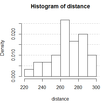
Note that you have to plot the histogram twice to display the grid under the main plot.
Since R 4.0.0 histograms are gray by default, not white.
Change histogram color
Now that you know how to create a histogram in R you can also customize it. Hence, if you want to change the bins color, you can set the col parameter to the color you prefer. As any other plots, you can customize lots of features of the graph, like the title, the axes, font size …
hist(distance, col = "lightblue")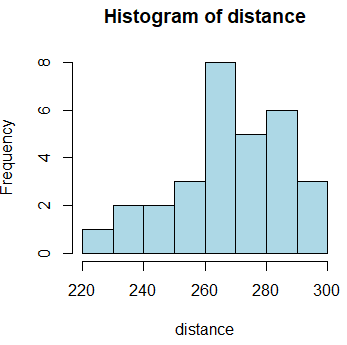
Breaks in R histogram
Histograms are very useful to represent the underlying distribution of the data if the number of bins is selected properly. However, the selection of the number of bins (or the binwidth) can be tricky:
- Few bins will group the observations too much.
- With many bins there will be a few observations inside each, increasing the variability of the obtained plot.
There are several rules to determine the number of bins. In R, the Sturges method is used by default. If you want to change the number of bins, you can set the argument breaks to the number you desire.
par(mfrow = c(1, 3))

hist(distance, breaks = 2, main = "Few bins")
hist(distance, breaks = 50, main = "Too many bins")
hist(distance, main = "Sturges method")

par(mfrow = c(1, 1))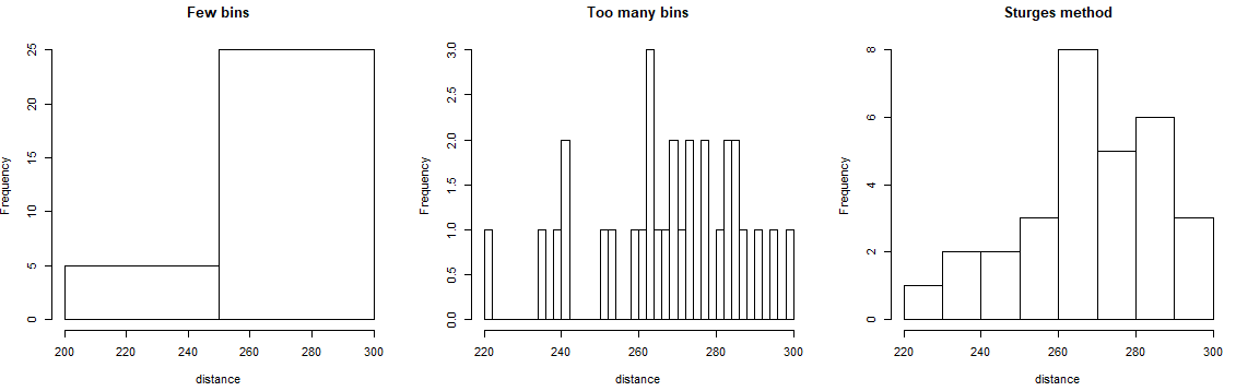
You can also use the plug-in methodology to select the bin width of a histogram by Wand (1995) implemented in the KernSmooth library as follows:
# Plug-in methodology
# install.packages("KernSmooth")
library(KernSmooth)

bin_width <- dpih(distance)

nbins <- seq(min(distance) - bin_width,
             max(distance) + bin_width, by = bin_width)

hist(distance, breaks = nbins, main = "Plug-in")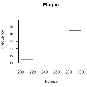
Histogram in R with two variables
Setting the argument add to TRUE allows you to plot a histogram over other plot. As an example, you could create an R histogram by group with the code of the following block:
set.seed(1)

x <- rnorm(1000)    # First group
y <- rnorm(1000, 1) # Second group

hist(x, main = "Two variables")
hist(y, add = TRUE, col = rgb(1, 0, 0, 0.5))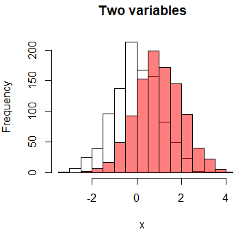
The rgb function sets color in RGB channel and the alpha argument sets the transparency. Indeed, when combining plots it is a good idea to set colors with transparency to see the plot behind.
Add normal curve to histogram
In order to plot a normal line curve over the histogram you can use the dnorm and the lines functions as follows:
hist(distance, prob = TRUE, main = "Histogram with normal curve")
x <- seq(min(distance), max(distance), length = 40)
f <- dnorm(x, mean = mean(distance), sd = sd(distance))
lines(x, f, col = "red", lwd = 2)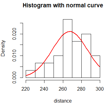
Add density line to histogram
In order to add a density curve over a histogram you can use the lines function for plotting the curve and density for calculating the underlying non-parametric (kernel) density of the distribution.
hist(distance, freq = FALSE, main = "Density curve")
lines(density(distance), lwd = 2, col = 'red')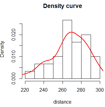
The bandwidth selection for adjusting non-parametric densities is an area of intense research. Also note that, by default, the density function uses the Gaussian kernel. For more information call ?density.
We are going to join the previous codes within a function to automatically create a histogram with normal and density lines:
histDenNorm <- function (x, main = "") {
   hist(x, prob = TRUE, main = main) # Histogram
   lines(density(x), col = "blue", lwd = 2) # Density
   x2 <- seq(min(x), max(x), length = 40)
   f <- dnorm(x2, mean(x), sd(x))
   lines(x2, f, col = "red", lwd = 2) # Normal
   legend("topright", c("Histogram", "Density", "Normal"), box.lty = 0,
          lty = 1, col = c("black", "blue", "red"), lwd = c(1, 2, 2))
}
Now, you can check the behavior of the function with sample data.
set.seed(1)

# Normal data
x <- rnorm(n = 5000, mean = 110, sd = 5)

# Exponential data
y <- rexp(n = 3000, rate = 1)

par(mfcol = c(1, 2))

histDenNorm(x, main = "Histogram of X")
histDenNorm(y, main = "Histogram of Y")

par(mfcol = c(1, 1))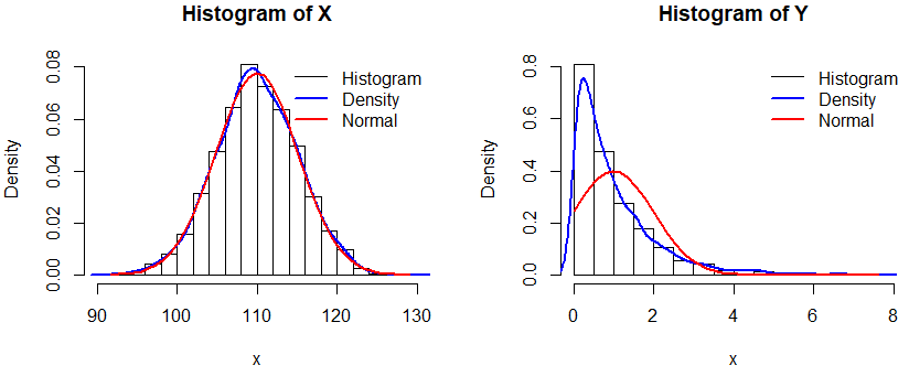
Combination: histogram and boxplot in R
You can add a boxplot over a histogram calling par(new = TRUE) between the plots.
hist(distance, probability = TRUE, ylab = "", main = "",
     col = rgb(1, 0, 0, alpha = 0.5), axes = FALSE)
axis(1) # Adds horizontal axis
par(new = TRUE)
boxplot(distance, horizontal = TRUE, axes = FALSE,
        lwd = 2, col = rgb(0, 0, 0, alpha = 0.2))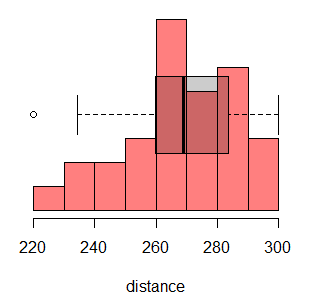
You could also add the normal or density curve to the previous plot.
Histogram in R with ggplot2
In order to create a histogram with the ggplot2 package you need to use the ggplot + geom_histogram functions and pass the data as data.frame. In the aes argument you need to specify the variable name of the dataframe.
# install.packages("ggplot2")
library(ggplot2)

ggplot(data.frame(distance), aes(x = distance)) +
       geom_histogram(color = "gray", fill = "white")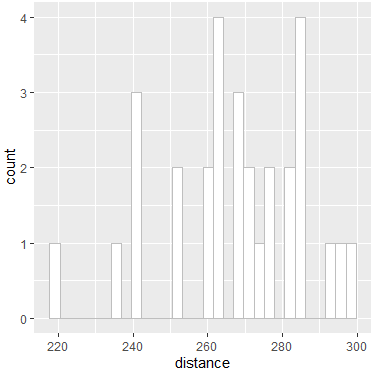
This plot will return a message warning you that the histogram was calculated using 30 bins. That’s because, by default, ggplot doesn’t use the Sturges method.
Now we are going to calculate the number of bins with the Sturges method as the hist function does and set it with the breaks argument. Note you could also set the binwidth argument if preferred.
# Calculating the breaks like the hist() function
nbreaks <- pretty(range(distance), n = nclass.Sturges(distance),
                  min.n = 1)

ggplot(data.frame(distance), aes(x = distance)) +
      geom_histogram(breaks = nbreaks, color = "gray", fill = "white")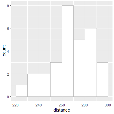
As you can see, this is equal to the first histogram.
In ggplot2 you can also add the density curve with the geom_density function. Moreover, if you want to fill the area under the curve, set the argument fill to the color you prefer and alpha to level of transparency of the color. Note that you need to set a new aes inside the geom_histogram as follows:
ggplot(data.frame(distance), aes(x = distance)) +
       geom_histogram(aes(y = ..density..), breaks = nbreaks,
                      color = "gray", fill = "white") +
       geom_density(fill = "black", alpha = 0.2)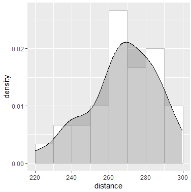
Plotly histogram
An alternative for creating histograms is to use the plotly package (an adaptation of the JavaScript plotly library to R), which creates graphics in an interactive format. For instance, you could run the following:
# install.packages("plotly")
library(plotly)

# Frequency histogram
fig <- plot_ly(x = distance, type = "histogram")
fig

# Density histogram
fig <- plot_ly(x = distance, type = "histogram", histnorm = "probability")
fig