Stripchart in R

Stripcharts or stripplots are one dimensional scatter charts. When dealing with small sample sizes (few data points), stripcharts in R are alternatives to boxplots or scatter plots to represent the observations. The R stripchart is also useful to overplot the data to other plots, in order to show the distribution of the data. In this tutorial we will explain with examples how to make and customize a stripchart in R programming.
The R stripchart() function
The stripchart function in R allows you to create one dimensional scatter plots. In order to create a default stripchart, pass a numerical variable to the function:
set.seed(1)

x <- rnorm(20)

stripchart(x)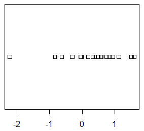
You can also customize the pch symbol used to create the plot, the line width and its color with the pch, lwd and col arguments, respectively. Note that symbols from 21 to 25 allows you to modify the background color of the symbol with the bg argument.
stripchart(x, pch = 21, col = 1, bg = 2, lwd = 2)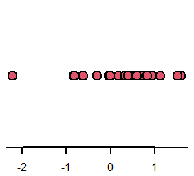
By default, the function draws a box with tick labels on the X-axis. However, you can remove the box and the axes setting the axes argument to FALSE. Then, you could use the axis function to add the axes you prefer.
stripchart(x, axes = FALSE)
axis(1)
axis(2)
An alternative is to remove the box, setting the argument frame to FALSE.
stripchart(x, frame = FALSE)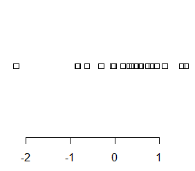
Flip stripchart axis in R
The R stripchart is drawn in horizontal by default. Nonetheless, you can flip the axes setting the argument vertical to TRUE in order to create a plot as the following:
stripchart(x, vertical = TRUE)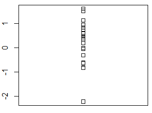
In addition, if you specify the argument las = 2, the tick marks of the vertical axis will be also vertical.
stripchart(x, vertical = TRUE, las = 2)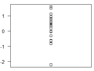
Chart methods
The stripchart function has three different methods to draw the data. By default the function uses the method 'overplot', which in case of ties overrides the observations. Other methods are 'stack', which stacks the observations creating a plot similar to a histogram and the method 'jitter', which adds random noise in order to display the observations. Consider, for instance, the following data with ties:
set.seed(1)

x <- round(runif(100, 0 , 10))
Overplot
As we pointed out before, the overplot method is used by default by the R stripchart function. Note that in this case, since there exist ties, although there are 100 data points, we can only see 11 in the plot.
stripchart(x, pch = 19, col = 4, main = "method = 'overplot'")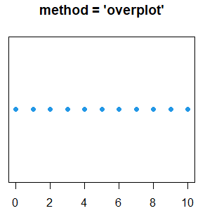
Stack
In order to display all the data you can set the argument method to 'stack'. This configuration will stack the repeated data points, creating a plot that represents the distribution of the data.
stripchart(x, pch = 19, method = "stack",
           col = 4, main = "method = 'stack'")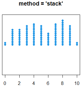
Jitter
The last alternative is to use the method 'jitter', that adds random noise in the vertical axis if the plot is horizontal or in the X-axis if the plot is vertical, in order to try to show all the data points.
stripchart(x, pch = 19, method = "jitter",
           col = 4, main = "method = 'jitter'")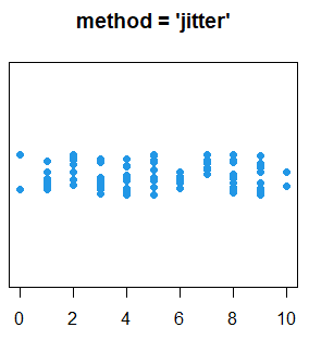
With this method, you can customize the argument jitter. For values greater (lower) than 0.2 it will increase (decrease) the amount of random noise applied to the points by default.
par(mfrow = c(1, 2))

set.seed(2)
stripchart(x, pch = 19, method = "jitter",
           col = 4, main = "method = 'jitter', jitter = 0.2")
axis(2)

set.seed(2)
stripchart(x, pch = 19, method = "jitter", jitter = 0.5,
           col = 4, main = "method = 'jitter', jitter = 0.5")
axis(2)

par(mfrow = c(1, 1))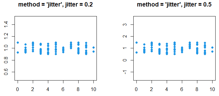
In the previous figure you can observe that the difference between the plots is the scale of the vertical axis. Nonetheless, if there are many data points some of them will overlap. In case you want to avoid the overlapping of the points we recommend you to look for beeswarm charts.
R stripchart by group
With the stripchart function you can also use a formula of the form y ~ x, where y is a numerical variable and x is a categorical variable or factor representing groups. In order to create an R stripchart by factor you can type:
set.seed(1)

x <- rnorm(100)

groups <- sample(c("A", "B", "C"), 100, replace = TRUE)

stripchart(x ~ groups, group.names = c("A", "B", "C"), pch = 19, method = "jitter",
           jitter = 0.2, vertical = TRUE, col = rainbow(length(unique(groups))))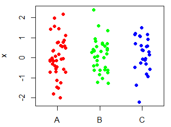
Note that we passed a vector of colors (as many as the number of groups) to the col argument in order to add colors by group.
Add mean to R stripchart
Sometimes it can be interesting to display the mean of the data points plotted with a strip chart. For a single stripchart you have two options: adding a mean point or a mean line with the points or abline functions, respectively.
set.seed(3)
y <- rexp(50)

par(mfrow = c(1, 2))

stripchart(y, pch = 16, col = 5, method = "jitter")
points(mean(y), col = 1, pch = 7, cex = 2, lwd = 2)

stripchart(y, pch = 16, col = 5, method = "jitter")
abline(v = mean(y), col = 1, pch = 7, cex = 2, lwd = 2, lty = 2)

par(mfrow = c(1, 1))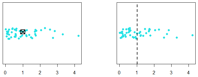
For a stripchart by factor you will need to calculate the mean for each group and add the mean points to each one as follows:
set.seed(3)
y <- rexp(100)

# Generating groups
groups <- sample(c("A", "B", "C"), 100, replace = TRUE)

par(mfrow = c(1, 2))

# Calculating the means
means <- sapply(levels(factor(groups)), function(i) mean(y[groups == i]))

# Horizontal stripchart
stripchart(y ~ groups, pch = 16, col = grey.colors(3),
           method = "jitter", las = 1)
points(means, 1:3, col = "red", pch = 7, cex = 1.5, bg = 2, lwd = 2)

# Vertical stripchart
stripchart(y ~ groups, pch = 16, col = grey.colors(3),
           method = "jitter", vertical = TRUE)
points(means, col = "red", pch = 7, cex = 1.5, bg = 2, lwd = 2)

par(mfrow = c(1, 1))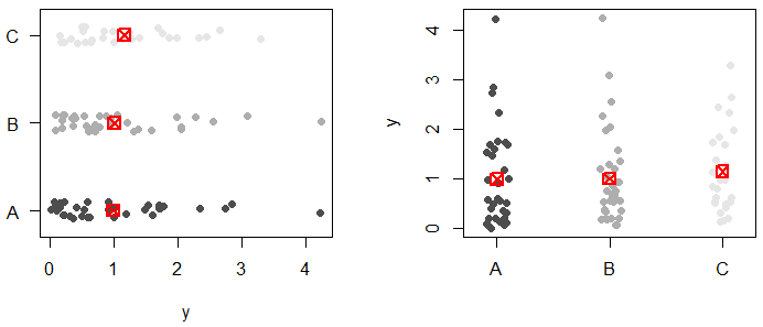
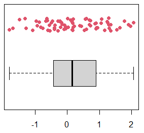
Add a stripchart to a boxplot
Finally, it is worth to mention that stripcharts are commonly displayed over boxplots when there are few observations, due to boxplots hide the underlying distribution of the data. In order to add a stripchart over a plot you have to create a plot and then specify add = TRUE on the stripchart function.
set.seed(4)
z <- rnorm(75)

par(mfrow = c(1, 2))

# Single boxplot
boxplot(z)
stripchart(z, add = TRUE, vertical = TRUE,
           method = "jitter", col = 2, pch = 19)

# Boxplot by group
g <- sample(c("A", "B"), 75, replace = TRUE)

boxplot(z ~ g)
stripchart(z ~ g, add = TRUE, vertical = TRUE,
           method = "jitter", col = 3:4, pch = 19)

par(mfrow = c(1, 1))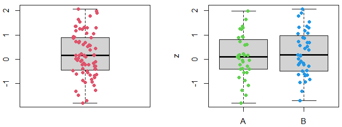
Note that the argument at allows you to modify the position to draw the stripchart, so it is not strictly needed to override the main plot.
set.seed(4)
z <- rnorm(75)

boxplot(z, horizontal = TRUE, xlim = c(0.5, 2))
stripchart(z, add = TRUE, method = "jitter", col = 2, pch = 19, at = 1.75)