Pie chart in R
A pie chart, also known as circle chart or pie plot, is a circular graph that represents proportions or percentages in slices, where the area and arc length of each slice is proportional to the represented quantity. Variations of this type of chart are doughnut charts, waffle charts and spie chart. In this tutorial we will review how to make a pie chart in base R.
Pie plot criticism
Before the explanations, it is worth to mention that pie charts, even very popular, have been widely criticized. As they are more difficult to read than other chart alternatives, are known to be misleading statistical graphs. The following plots represent the same variables displayed with pie charts and with bar plots.
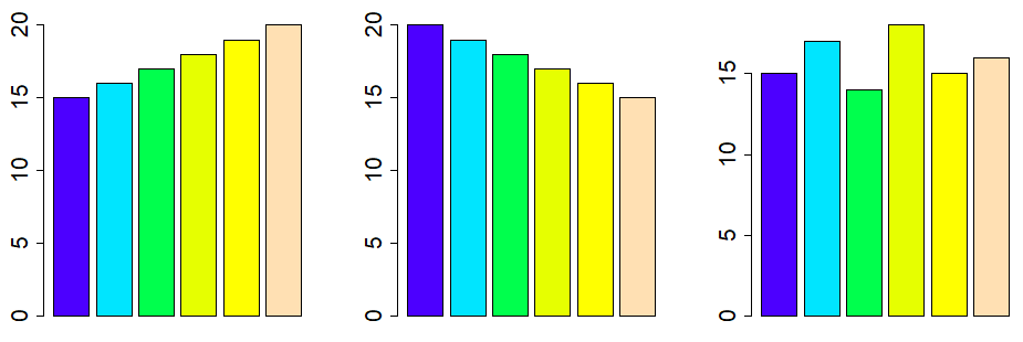
As you can see in the previous example, bar plots are easier to read than pie charts. Nonetheless, pie charts can be useful in many situations, for instance, where the data is very unbalanced.
Pie charts have been criticized due to it is difficult for human eyes to read angles. In the most cases it is more recommended to use barplots instead, as they are easier to read.
How to draw a pie chart in R?
A circle chart can be created with the pie function in base R. Even though there exists more packages to create pie charts, like ggplot2, in this tutorial we will review how to create circle chart with the pie function and the PieChart function of the lessR package, to display percentages.
The pie() R function
The R pie function allows you to create a pie chart in R. Consider, for instance, that you want to create a piechart of the following variable, that represents the count of some event:
count <- c(7, 25, 16, 12, 10, 30)The code for a pie chart in R is as follows. Note that you can customize the size of the pie (from -1 to 1) with the radius argument, that by default takes the value 0.8.
pie(count)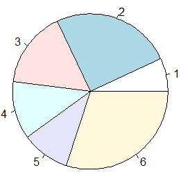
You can also modify the direction of the pie with the clockwise argument, that by default is FALSE.
pie(count, clockwise = TRUE)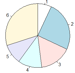
However, you may have noticed that the plot doesn’t display the corresponding value of each slice. To solve this issue you can pass the vector to the labels argument as follows.
pie(count, labels = count)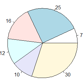
If preferred, you can add a character vector with the names you desire to represent each slice:
pie(count, labels = c("0-15", "16-30", "31-45", "46-60", "61-75", "76-90"))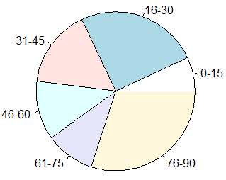
Customization
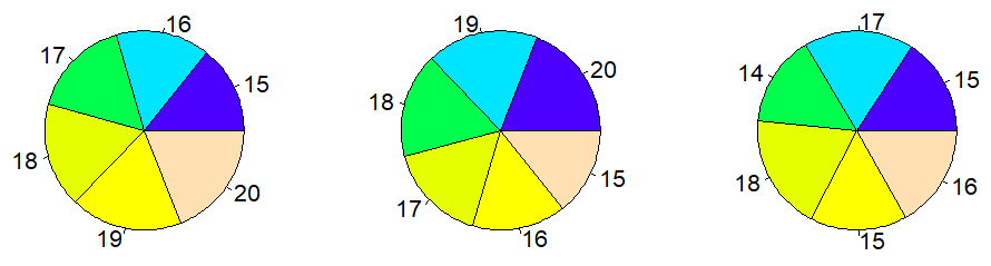
In addition, you can modify the color of the graph with the col argument. In the following block of code we show you how to use different color palettes. Note that the cex argument allows you to modify the size of the labels.
par(mfrow = c(1, 3))

pie(count, labels = count, col = 1:6, cex = 2)
pie(count, labels = count, col = rainbow(6), cex = 2)
pie(count, labels = count, col = topo.colors(6), cex = 2)

par(mfrow = c(1, 1))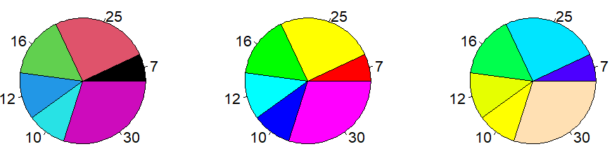
However, the best pie chart color palettes may be the ones of the brewer.pal function of the RColorBrewer package.
# install.packages("RColorBrewer")
library(RColorBrewer)

color <- brewer.pal(length(count), "Set2")

pie(count, labels = count, col = color)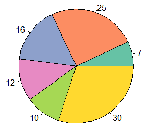
You can also specify a vector of colors for the border of each slice. If you want the color to be equal to the color of the area of the slice you can type:
pie(count, labels = count, col = color, border = color)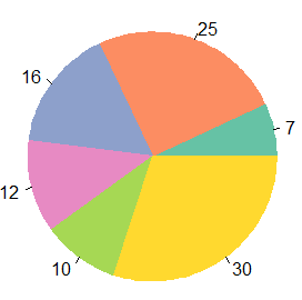
If you want to modify the line type of the borders of the plot you can make use of the lty argument:
pie(count, labels = count, col = color, lty = 2)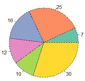
Furthermore, you can add shading lines with the density argument. The greater the value, the greater number of lines to be displayed. Note that the angle argument can be used to modify the angle of the lines.
pie(count, labels = count, col = color, density = 50, angle = 45)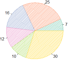
Finally, you can also customize the number of polygons used to create the chart. By default, the edges argument is 200, but if you specify a lower value you can create something like the following:
pie(count, labels = count, edges = 10)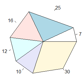
Pie chart in R with percentage
Circle charts are very useful to show percentages, but the pie function doesn’t allow you to automatically display them. In order to show percentages for the sample vector (as the sum of the elements is equal to 100), you can type:
pie(count, labels = paste0(count, "%"))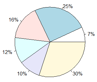
Nevertheless, a more generic approach is to calculate the corresponding percentages. For that purpose. consider the following vector:
count_2 <- c(15, 27, 25, 10)As in this case, the sum of the components of the vector is not equal to 100, the corresponding percentage is different to the corresponding number of the vector. In the next block of code we show you how to calculate the percentages. Note that the round function allows you to modify the number of decimals.
pie_labels <- paste0(round(100 * count_2/sum(count_2), 2), "%")

pie(count_2, labels = pie_labels)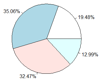
However, if you also want to display the numbers or labels of the original vector you could write:
pie_labels <- paste0(count_2, " = ", round(100 * count_2/sum(count_2), 2), "%")
pie(count_2, labels = pie_labels)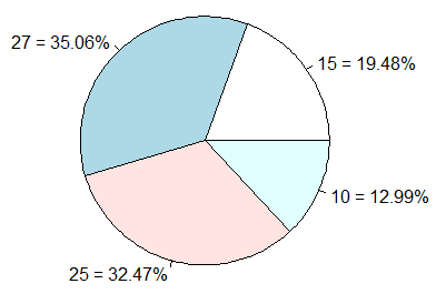
An alternative to display percentages on the pie chart is to use the PieChart function of the lessR package, that shows the percentages in the middle of the slices. However, the input of this function has to be a categorical variable (or numeric, if each different value represents a category, as in the example) of a data frame, instead of a numeric vector. Recall to type ?PieChart or help(PieChart) for additional information.
# install.packages("lessR)
library(lessR)

# Data frame with the new variable
my_data <- data.frame(x = c(rep(count_2[1], count_2[1]),  # 15 times 15
                            rep(count_2[2], count_2[2]),  # 27 times 27
                            rep(count_2[3], count_2[3]),  # 25 times 25
                            rep(count_2[4], count_2[4]))) # 10 times 10

PieChart(x, hole = 0, values = "%", data = my_data, fill = 1:4, main = "")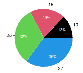
Pie chart of categorical data
Consider, for instance, that you want to create a circle chart with the corresponding percentage of males and females registered in some event. You have the following data:
gender_var <- factor(c(rep("Male", 10), rep("Female", 20)))
gender_var
Male Male Male Male Male Male Male Male Male Male
Female Female Female Female Female Female Female Female Female Female
Female Female Female Female Female Female Female Female Female Female
Levels: Female MaleHence, as you have a character variable, you can use the table function to count the number of males and females of the character vector and pass the output to the pie function.
gender_table <- table(gender_var)

pie(gender_table)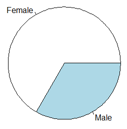
An alternative is to use the PieChart function, but as we pointed out before, you need to create a data frame with a character or factor variable:
gender <- data.frame(gend = gender_var)

# install.packages("lessR")
library(lessR)

PieChart(gend, hole = 0, values = "%", data = gender,
         fill = c("lightblue", "pink"), main = "")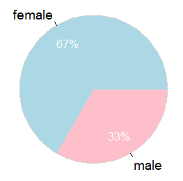
Adding a legend
In order to create a pie chart in R with legend you need to use the legend function. As an example, if you want to display a legend in the top left of the image you can execute the following code:
count_3 <- c(20, 50, 30)
# sum(count_3) # 100

pie(count_3, labels = paste0(count_3, "%"))

legend("topleft", legend = c("Theatre", "Series", "Movies"),
       fill =  c("white", "lightblue", "mistyrose"))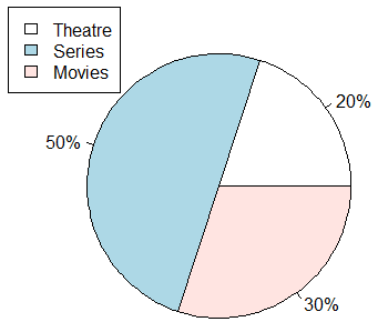
3D pie chart
In this final section you will learn how to draw a 3D pie chart in R. For that purpose, you will need to install the plotrix package, that contains the pie3D function. The code to draw a 3D pie chart in R is the following:
# install.packages("plotrix")
library(plotrix)
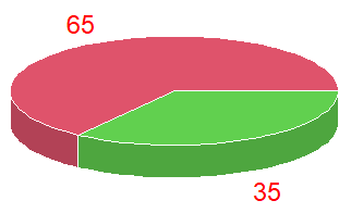
num_data <- c(65, 35)
pie3D(num_data)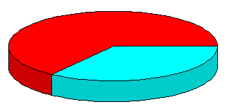
You can also pass a table as an argument, in order to create a 3D pie plot with categorical data.
Note that by default the function doesn’t display labels, so you will need to indicate them in the labels argument
pie3D(num_data, labels = num_data)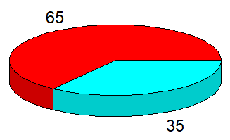
In addition, you can explode the pie with the explode argument:
pie3D(num_data, labels = num_data, explode = 0.25)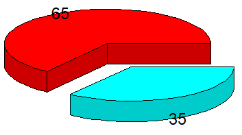
Finally, as in other plots, you can customize several graphical parameters of the final plot, as the colors, colors of the labels or the border color, among others. Recall to type help(pie3D) or ?pie3D for additional details.
pie3D(num_data, labels = num_data, col = 2:3, labelcol = "red", border = "white")