Correlation plot in R

Correlation plots, also known as correlograms for more than two variables, help us to visualize the correlation between continuous variables. In this tutorial we will show you how to plot correlation in base R with different functions and packages.
How to plot correlation in R?
There are two ways for plotting correlation in R. On the one hand, you can plot correlation between two variables in R with a scatter plot. Note that the last line of the following block of code allows you to add the correlation coefficient to the plot.
# Data generation
set.seed(1)
x <- 1:100
y <- x + rnorm(100, mean = 0, sd = 15)

# Creating the plot
plot(x, y, pch = 19, col = "lightblue")

# Regression line
abline(lm(y ~ x), col = "red", lwd = 3)

# Pearson correlation
text(paste("Correlation:", round(cor(x, y), 2)), x = 25, y = 95)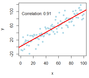
You can also calculate Kendall and Spearman correlation with the cor function, setting the method argument to "kendall" or "spearman". E.g. cor(x, y, method = "kendall").
On the other hand, if you have more than two variables, there are several functions to visualize correlation matrices in R, which we will review in the following sections.
Plot pairwise correlation: pairs and cpairs functions
The most common function to create a matrix of scatter plots is the pairs function. For explanation purposes we are going to use the well-known iris dataset.
data <- iris[, 1:4] # Numerical variables
groups <- iris[, 5] # Factor variable (groups)
With the pairs function you can create a pairs or correlation plot from a data frame. Note that you can also specify a formula if preferred.
# Plot correlation matrix
pairs(data)

# Equivalent with a formula
pairs(~ Sepal.Length + Sepal.Width + Petal.Length + Petal.Width, data = iris)

# Equivalent but using the plot function
plot(data) 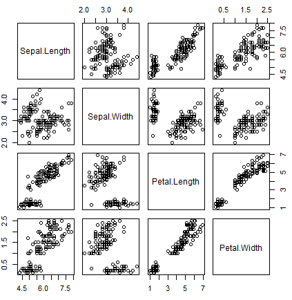
The function can be customized with several arguments. In the following example we show you how to fully customize the scatter matrix plot, coloring the data points by group.
pairs(data,                     # Data frame of variables
      labels = colnames(data),  # Variable names
      pch = 21,                 # Pch symbol
      bg = rainbow(3)[groups],  # Background color of the symbol (pch 21 to 25)
      col = rainbow(3)[groups], # Border color of the symbol
      main = "Iris dataset",    # Title of the plot
      row1attop = TRUE,         # If FALSE, changes the direction of the diagonal
      gap = 1,                  # Distance between subplots
      cex.labels = NULL,        # Size of the diagonal text
      font.labels = 1)          # Font style of the diagonal text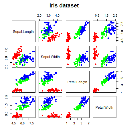
The pairs function also allows you to specify custom functions on the upper.panel, lower.panel and diag.panel arguments. Note that if you want to delete some panels you can set them to NULL.
On the one hand, you can add histograms and density lines to the diagonal with the following code:
# Function to add histograms
panel.hist <- function(x, ...) {
    usr <- par("usr")
    on.exit(par(usr))
    par(usr = c(usr[1:2], 0, 1.5))
    his <- hist(x, plot = FALSE)
    breaks <- his$breaks
    nB <- length(breaks)
    y <- his$counts
    y <- y/max(y)
    rect(breaks[-nB], 0, breaks[-1], y, col = rgb(0, 1, 1, alpha = 0.5), ...)
    # lines(density(x), col = 2, lwd = 2) # Uncomment to add density lines
}

# Creating the scatter plot matrix
pairs(data,
      upper.panel = NULL,         # Disabling the upper panel
      diag.panel = panel.hist)    # Adding the histograms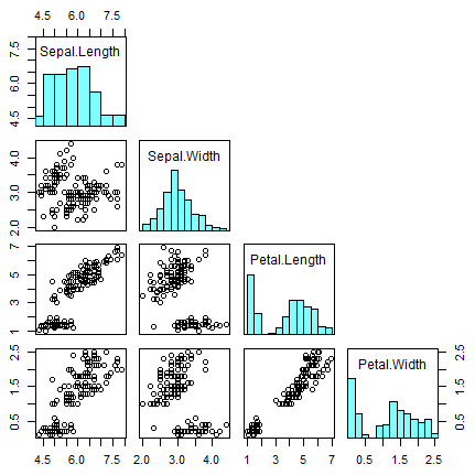
On the other hand, you can add the correlation coefficients in absolute terms, resized by the level of correlation, with the code of the following block. Note that you can add smoothed regression lines passing the panel.smooth function to the lower.panel argument.
# Function to add correlation coefficients
panel.cor <- function(x, y, digits = 2, prefix = "", cex.cor, ...) {
    usr <- par("usr")
    on.exit(par(usr))
    par(usr = c(0, 1, 0, 1))
    Cor <- abs(cor(x, y)) # Remove abs function if desired
    txt <- paste0(prefix, format(c(Cor, 0.123456789), digits = digits)[1])
    if(missing(cex.cor)) {
        cex.cor <- 0.4 / strwidth(txt)
    }
    text(0.5, 0.5, txt,
         cex = 1 + cex.cor * Cor) # Resize the text by level of correlation
}

# Plotting the correlation matrix
pairs(data,
      upper.panel = panel.cor,    # Correlation panel
      lower.panel = panel.smooth) # Smoothed regression lines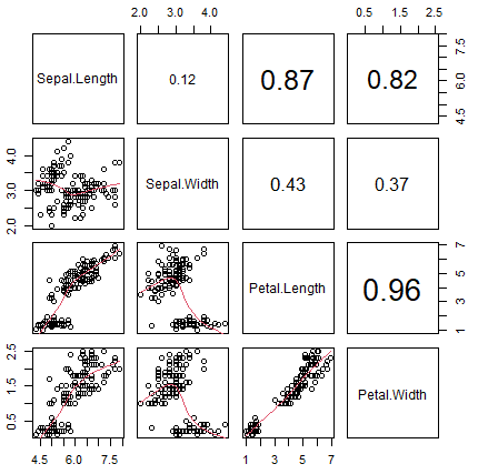
cpairs function from gclus package
The cpairs function of the gclus package is very similar to the previous one. The main difference is that the cpairs function enhance the previous allowing you to order the variables and color the subplots by correlation.
# install.packages("gclus")
library(gclus)

# Correlation in absolute terms
corr <- abs(cor(data))

colors <- dmat.color(corr)
order <- order.single(corr)

cpairs(data,                    # Data frame of variables
       order,                   # Order of the variables
       panel.colors = colors,   # Matrix of panel colors
       border.color = "grey70", # Borders color
       gap = 0.45,              # Distance between subplots
       main = "Ordered variables colored by correlation", # Main title
       show.points = TRUE,      # If FALSE, removes all the points
       pch = 21,                # pch symbol
       bg = rainbow(3)[iris$Species]) # Colors by group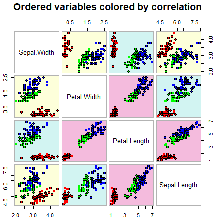
This function allows you to specify all the arguments available on the pairs.default function.
chart.Correlation function
The chart.Correlation function of the PerformanceAnalytics package is a shortcut to create a correlation plot in R with histograms, density functions, smoothed regression lines and correlation coefficients with the corresponding significance levels (if no stars, the variable is not statistically significant, while one, two and three stars mean that the corresponding variable is significant at 10%, 5% and 1% levels, respectively) with a single line of code:
# install.packages("PerformanceAnalytics")
library(PerformanceAnalytics)

chart.Correlation(data, histogram = TRUE, method = "pearson")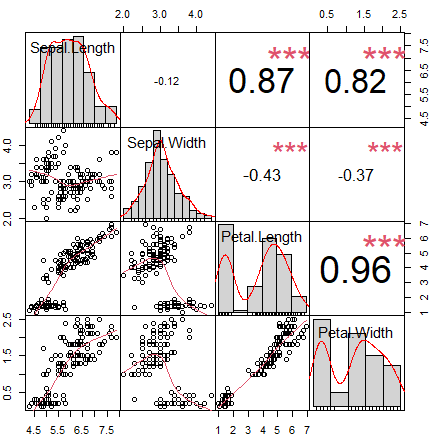
The function also allows you to specify the arguments of the pairs function.
psych correlation plot
The package pysch provides two interesting functions to create correlation plots in R. The pairs.panel function is an extension of the pairs function that allows you to easily add regression lines, histograms, confidence intervals, … and customize several additional arguments.
# install.packages("psych")
library(psych)

pairs.panels(data,
             smooth = TRUE,      # If TRUE, draws loess smooths
             scale = FALSE,      # If TRUE, scales the correlation text font
             density = TRUE,     # If TRUE, adds density plots and histograms
             ellipses = TRUE,    # If TRUE, draws ellipses
             method = "pearson", # Correlation method (also "spearman" or "kendall")
             pch = 21,           # pch symbol
             lm = FALSE,         # If TRUE, plots linear fit rather than the LOESS (smoothed) fit
             cor = TRUE,         # If TRUE, reports correlations
             jiggle = FALSE,     # If TRUE, data points are jittered
             factor = 2,         # Jittering factor
             hist.col = 4,       # Histograms color
             stars = TRUE,       # If TRUE, adds significance level with stars
             ci = TRUE)          # If TRUE, adds confidence intervals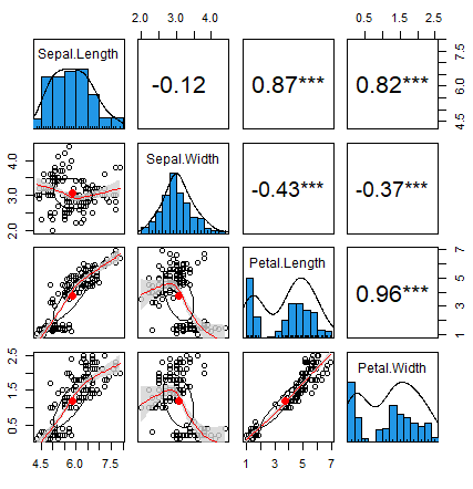
The corPlot function creates a graph of a correlation matrix, coloring the regions by the level of correlation.
library(psych)

corPlot(data, cex = 1.2)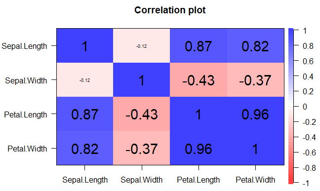
Recall to type ?corPlot for additional arguments and details.
Correlogram with corrgram and corrplot packages
corrgram function
On the one hand, the corrgram package calculates the correlation of the data and draws correlograms. The function of the same name allows customization via panel functions. As an example, you can create a correlogram in R where the upper panel shows pie charts and the lower panel shows shaded boxes with the following code:
# install.packages("corrgram")
library(corrgram)

corrgram(data,
         order = TRUE,              # If TRUE, PCA-based re-ordering
         upper.panel = panel.pie,   # Panel function above diagonal
         lower.panel = panel.shade, # Panel function below diagonal
         text.panel = panel.txt,    # Panel function of the diagonal
         main = "Correlogram")      # Main title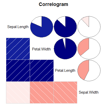
There are several panel functions that you can use. Using the apropos function you can list all of them:
apropos("panel.")"panel.bar" "panel.conf" "panel.cor" "panel.density"
"panel.ellipse" "panel.fill" "panel.minmax" "panel.pie"
"panel.pts" "panel.shade" "panel.smooth" "panel.txt" You can’t use all the panel types on all the panel arguments. Recall to type ?corrgram or help(corrgram) for additional details and arguments.
corrplot and corrplot.mixed functions
On the other hand, the corrplot package is a very flexible package, which allows creating a wide variety of correlograms with a single function. The most common arguments of the main function are described below, but we recommend you to call ?corrplot for additional details. Note that for this function you need to pass the correlation matrix instead of the variables.
# install.packages("corrplot")
library(corrplot)

corrplot(cor(data),        # Correlation matrix
         method = "shade", # Correlation plot method
         type = "full",    # Correlation plot style (also "upper" and "lower")
         diag = TRUE,      # If TRUE (default), adds the diagonal
         tl.col = "black", # Labels color
         bg = "white",     # Background color
         title = "",       # Main title
         col = NULL)       # Color palette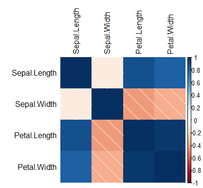
You can use the colorRampPalette function to generate color spectra.
The argument method allows you to select between "circle" (default), "square", "ellipse", "number", "shade", "pie", and "color". As we previously used the shaded method, we show the remaining on the following plot:
par(mfrow = c(2, 3))

# Circles
corrplot(cor(data), method = "circle",
        title = "method = 'circle'",
        tl.pos = "n", mar = c(2, 1, 3, 1))
# Squares
corrplot(cor(data), method = "square",
        title = "method = 'square'",
        tl.pos = "n", mar = c(2, 1, 3, 1))
# Ellipses
corrplot(cor(data), method = "ellipse",
         title = "method = 'ellipse'",
         tl.pos = "n", mar = c(2, 1, 3, 1))
# Correlations
corrplot(cor(data), method = "number",
         title = "method = 'number'",
         tl.pos = "n", mar = c(2, 1, 3, 1))
# Pie charts
corrplot(cor(data), method = "pie",
         title = "method = 'pie'",
         tl.pos = "n", mar = c(2, 1, 3, 1))
# Colors
corrplot(cor(data), method = "color",
         title = "method = 'color'",
         tl.pos = "n", mar = c(2, 1, 3, 1))

par(mfrow = c(1, 1))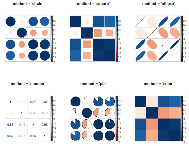
This function also allows clustering the data. The clustering methods according to the documentation are: "original" (default order), "AOE" (angular order of eigenvectors), "FPC" (first principal component order), "hclust" (hierarchical clustering order) and "alphabet" (alphabetical order).
If you chose hierarchical clustering you can select between the following methods: "ward", "ward.D", "ward.D2", "single", "complete", "average", "mcquitty", "median" and "centroid". In this case, you can also create clustering with rectangles. An example is shown in the following block of code:
corrplot(cor(data),
         method = "circle",
         order = "hclust",         # Ordering method of the matrix
         hclust.method = "ward.D", # If order = "hclust", is the cluster method to be used
         addrect = 2,              # If order = "hclust", number of cluster rectangles
         rect.col = 3,             # Color of the rectangles
         rect.lwd = 3)             # Line width of the rectangles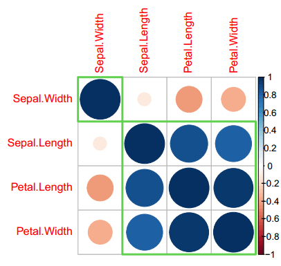
Finally, the corrplot.mixed function of the package allows drawing correlograms with mixed methods. In this case, you can mix the correlation plot methods setting the desired to the lower (below diagonal) and upper (above diagonal) arguments.
# install.packages("corrplot")
library(corrplot)

corrplot.mixed(cor(data),
               lower = "number",
               upper = "circle",
               tl.col = "black")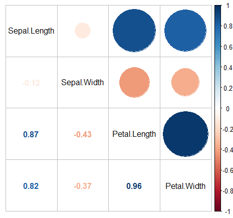
As the customization possibilities of the functions of the corrplot package are huge, we recommend you to type vignette("corrplot-intro") for further details.